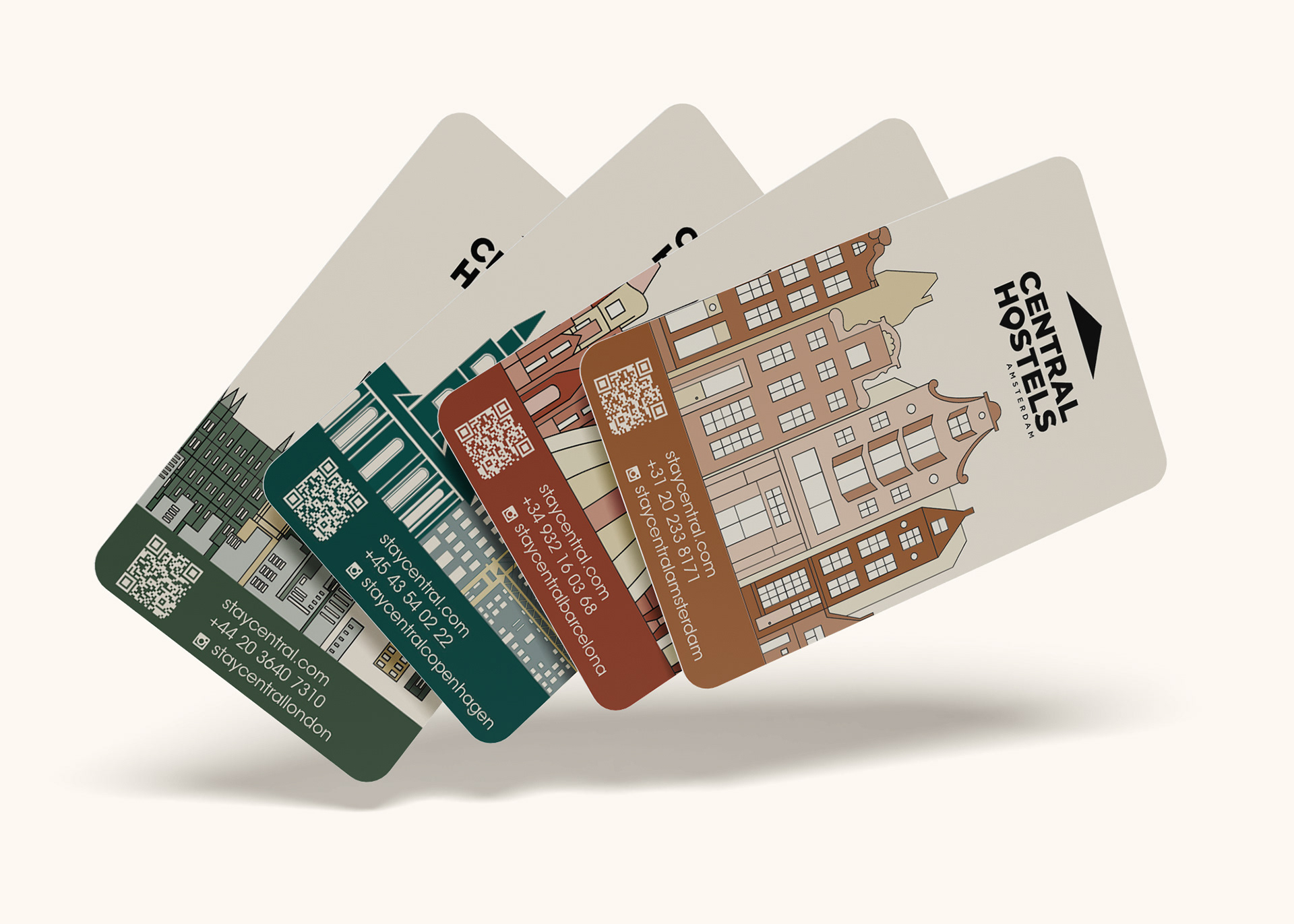
Central Hostels Keycards

Central Hostels Keycards Holder
Project Background
The Central Hostels campaign focused on designing collateral for a chain of hostels across Europe, Australia, and New Zealand. This mock company offers independent travellers and groups a wide selection of accommodations. All properties include a range of room types from shared to private bedrooms, chill-out areas, bars, cafes, and a variety of spaces for private hire - from street facing or basement exhibition spaces to penthouse suites and rooftops. They have award-winning interior design and hosts locally inspired curated events alongside its wide range of food and beverage options. Central Hostels was seeking a welcome package for their newest locations (Amsterdam, Barcelona, Copenhagen, and London) consisting of keycards, a keycard holder, digital ads and billboards, and an editorial.
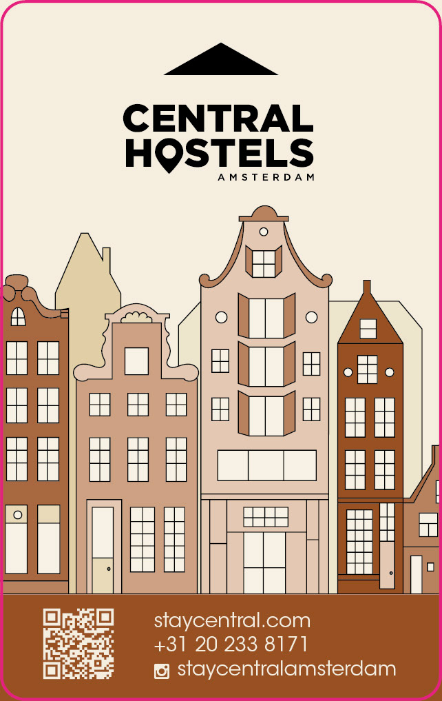
Amsterdam Keycard Dieline
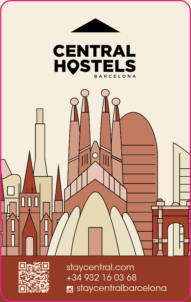
Barcelona Keycard Dieline
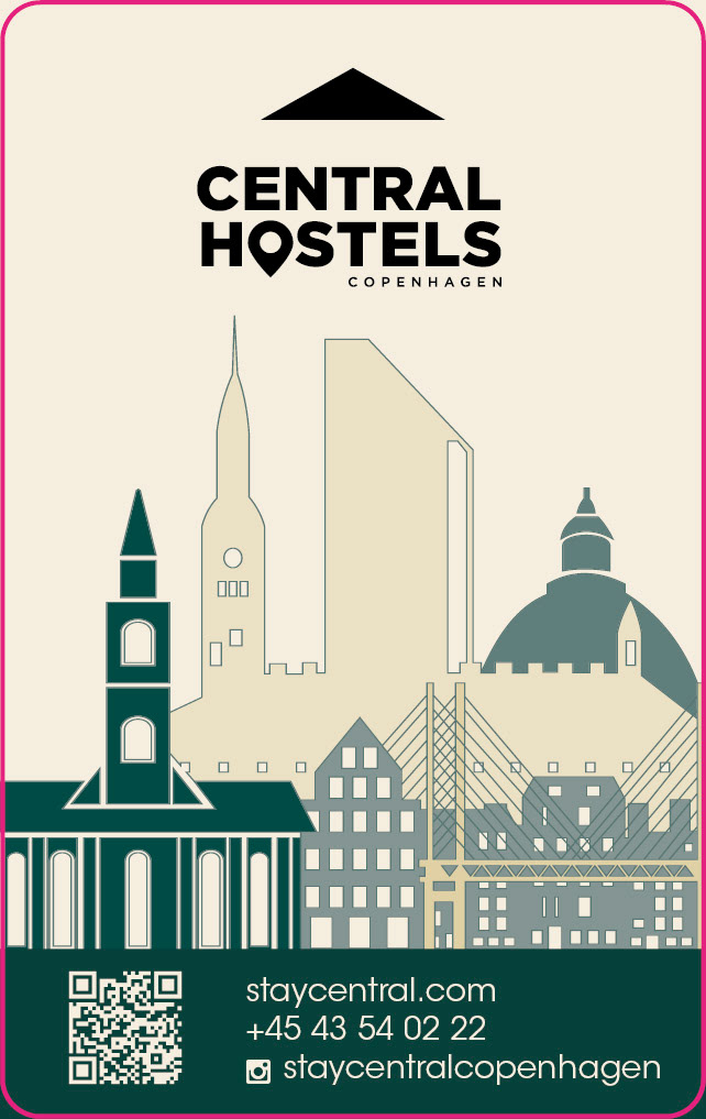
Copenhagen Keycard Dieline
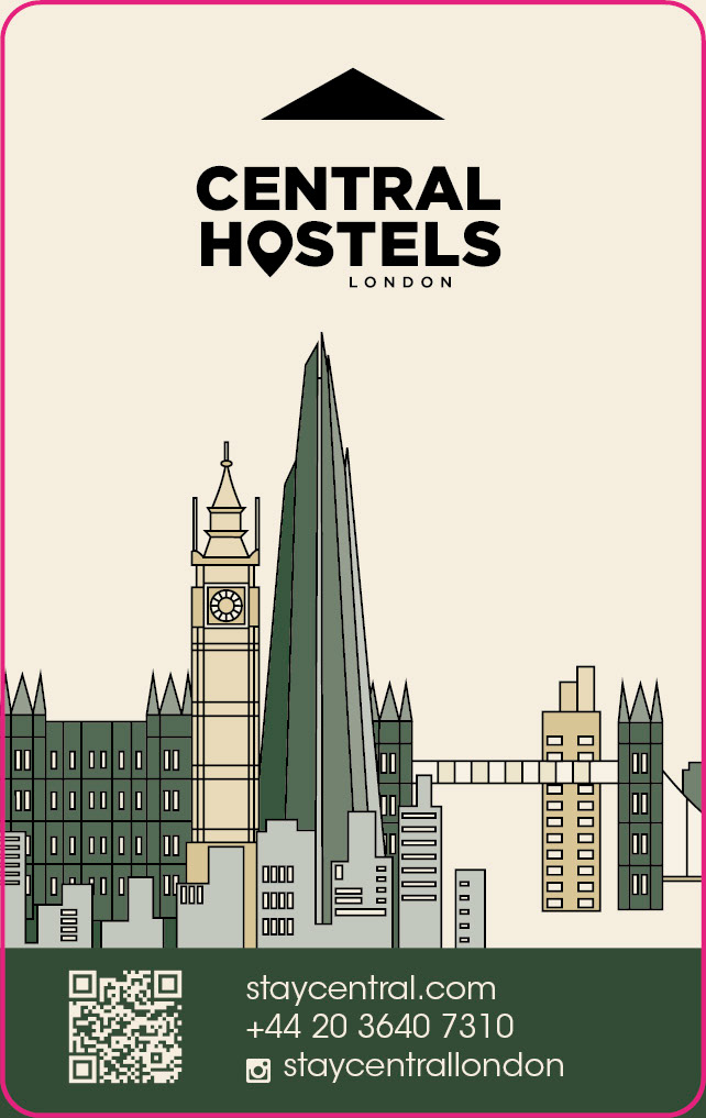
London Keycard Dieline

Keycard Holder Dieline (Front)
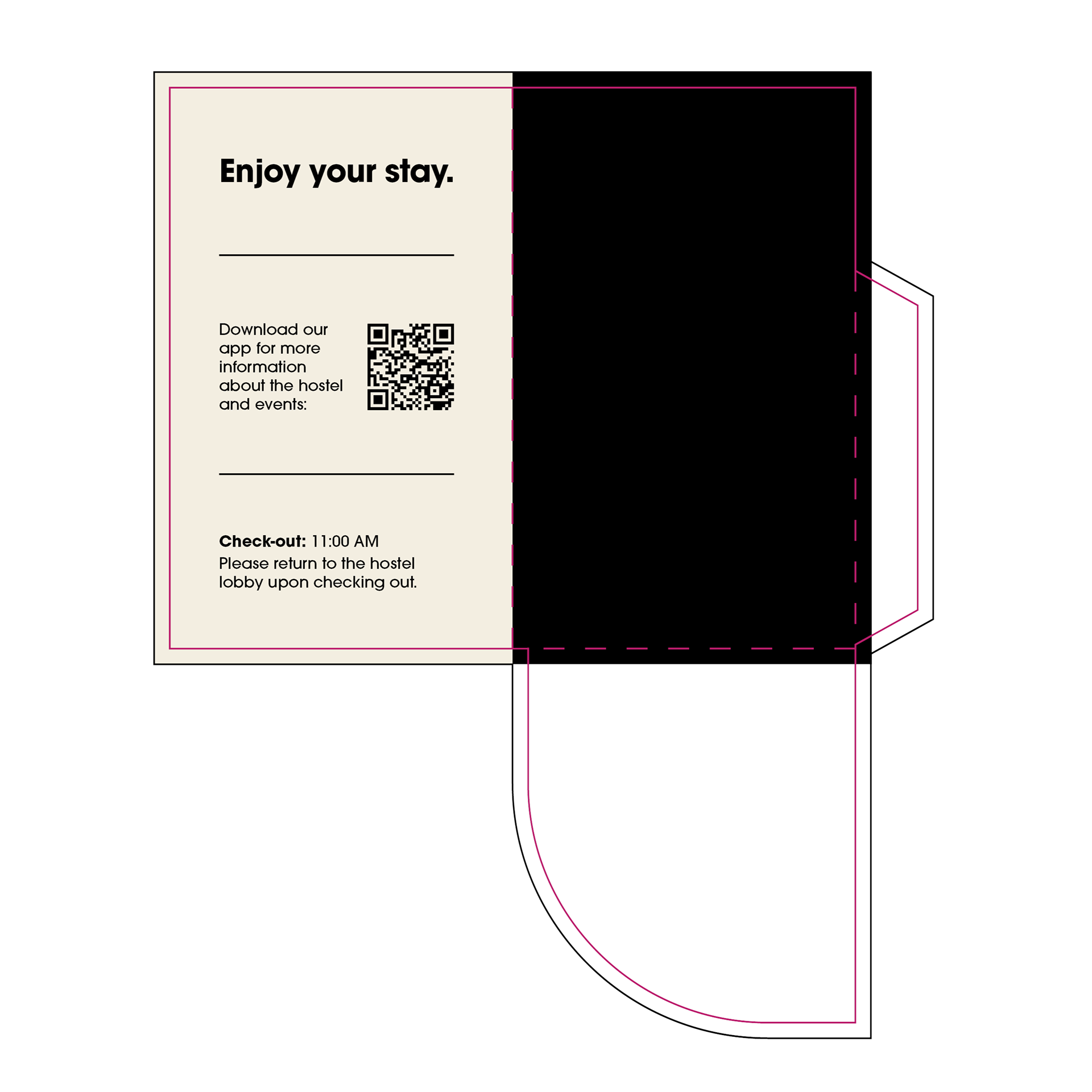
Keycard Holder Dieline (Back)
Obstacle & Approach
The biggest challenge with this campaign was unifying a wide range of assets across both new and existing hostel locations. Everything had to feel cohesive while still reflecting the unique character of each city. I was responsible for designing physical and digital pieces including keycards, keycard holders, billboards, digital ads, and a Spring 2024 newsletter, all connected through Central Hostels' updated visual identity.
I began with the keycards, each designed to highlight a specific location. These had to be created using only vector elements, which limited the level of detail but opened up opportunities to be more inventive. I created a shared keycard holder that featured a custom icon-based pattern that appears throughout the campaign collateral. This gave the system a personal, recognizable feel. The colour palette used two core brand colours (cream and black), along with one location-specific colour per city for added variation and visual clarity.
In early drafts, the assets felt too separate. They lacked the unity needed to work as a full campaign. Through iteration, I refined the icon pattern, colour use, and layout structure across all components. These changes helped the pieces connect more intentionally and made each asset feel like it belonged to the same family while still keeping its own identity.
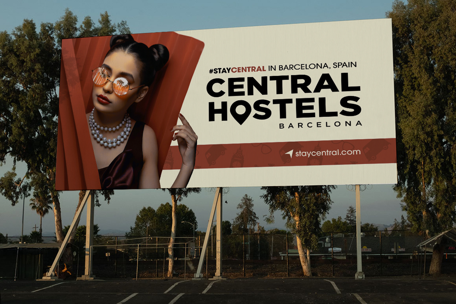
Barcelona Billboard
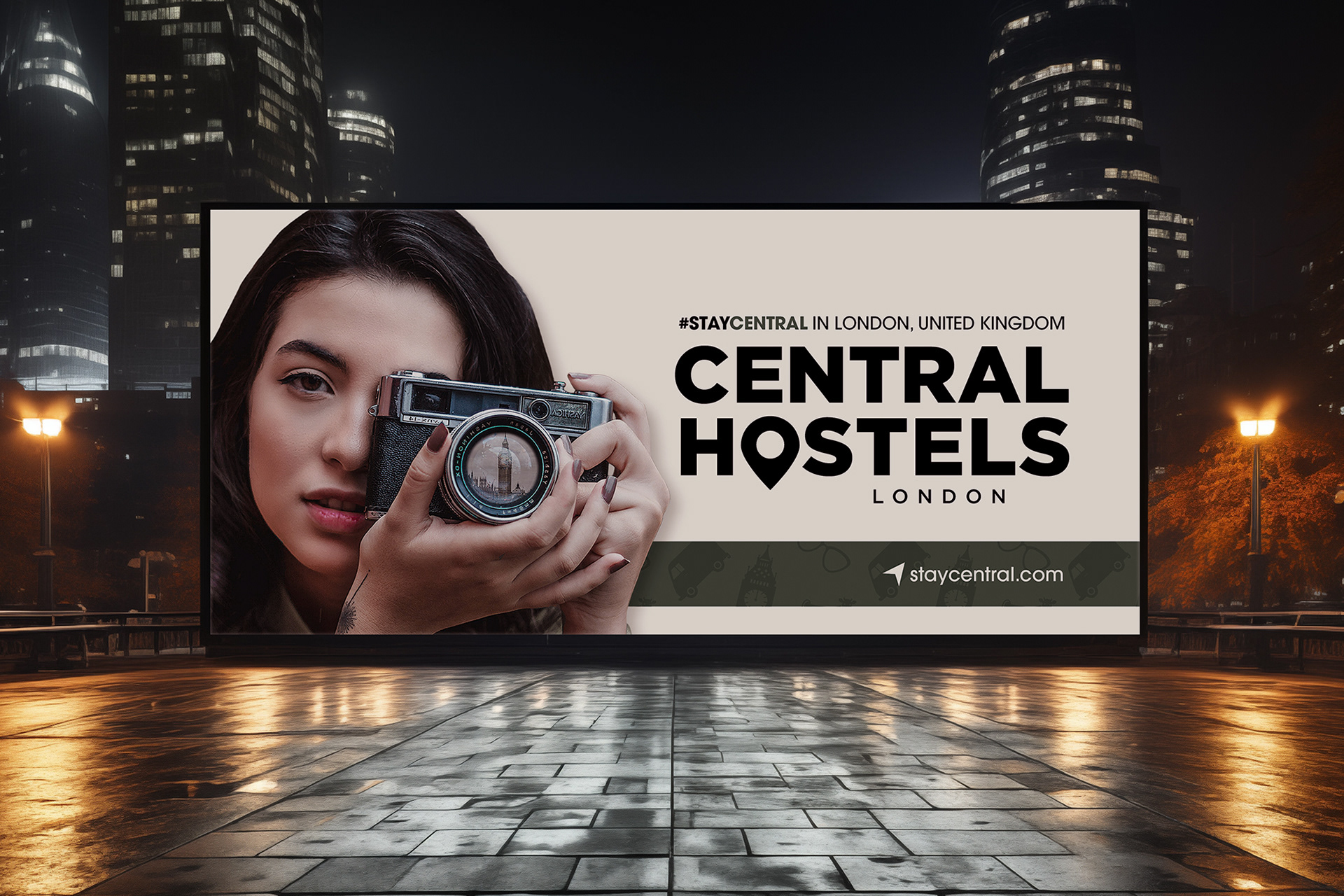
London Billboard

Barcelona Billboard Design

London Billboard Design
For the billboards, I focused on drawing viewers into the destination. Instead of using standard scenic backgrounds, I placed city landmarks inside sunglasses and camera lenses worn by the subjects. This created a cleaner layout and added a more immersive visual moment. Including people made the designs more relatable, and their eyelines became key focal points when adapting to different billboard formats. Since the designs were created at a smaller scale than their final printed size, I planned carefully around image clarity and resolution.
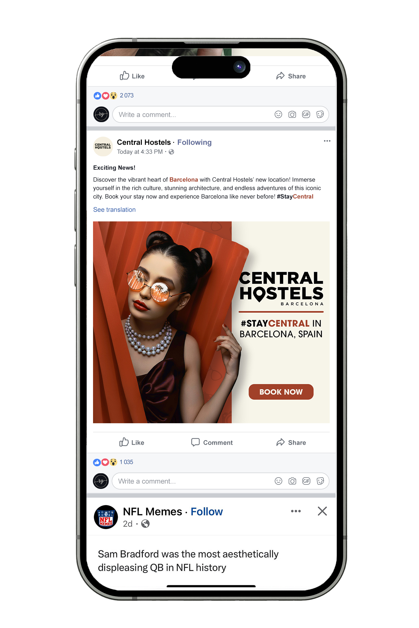
Digital Ad on Facebook

Barcelona Box Ad
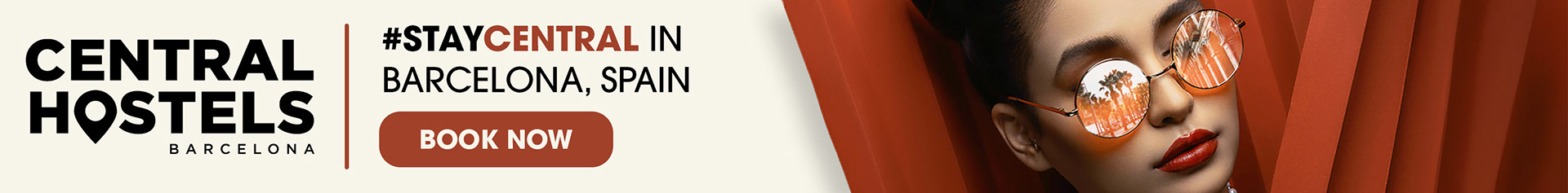
Barcelona Leaderboard Ad

London Box Ad

London Leaderboard Ad
The digital ads were developed as complements to the billboards. I used the same visual structure, location colours, and call-to-action elements. Central Hostels requested that the ads include a "Book Now" button rather than a website reference, which guided the layout decisions across various ad sizes. Placing focal points near the subject’s eyeline helped maintain clarity, even at smaller dimensions.
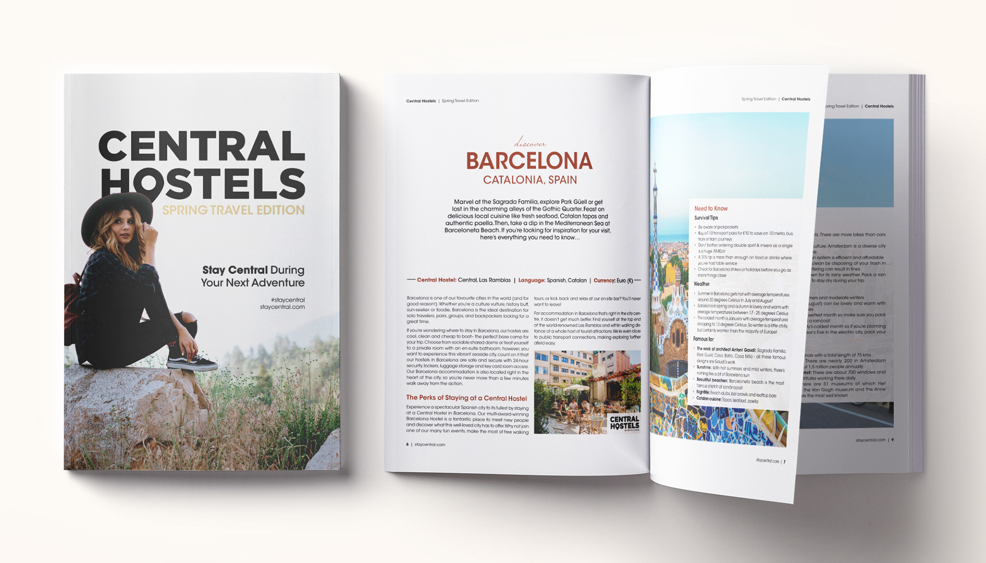
Newsletter: Spring Travel Edition
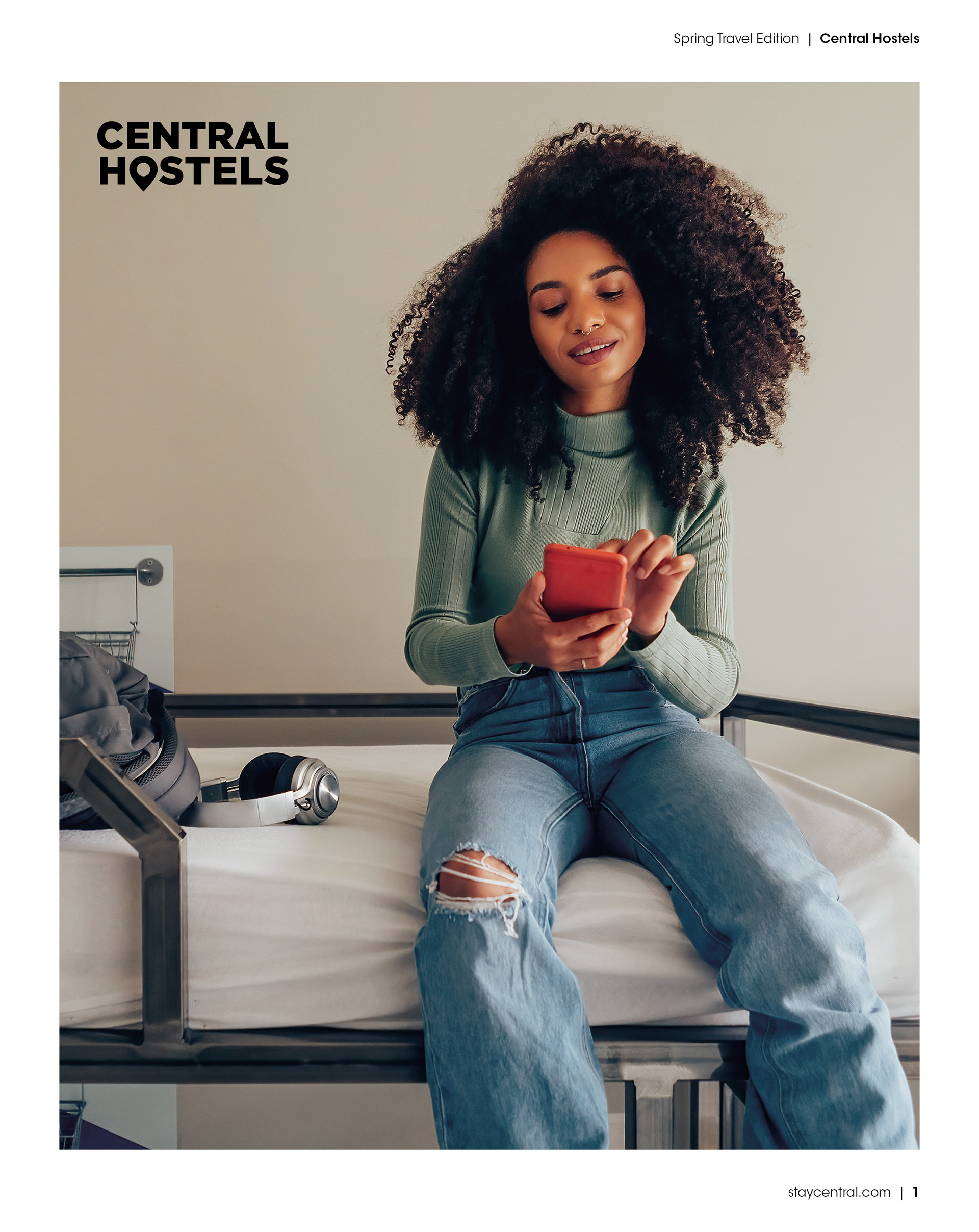
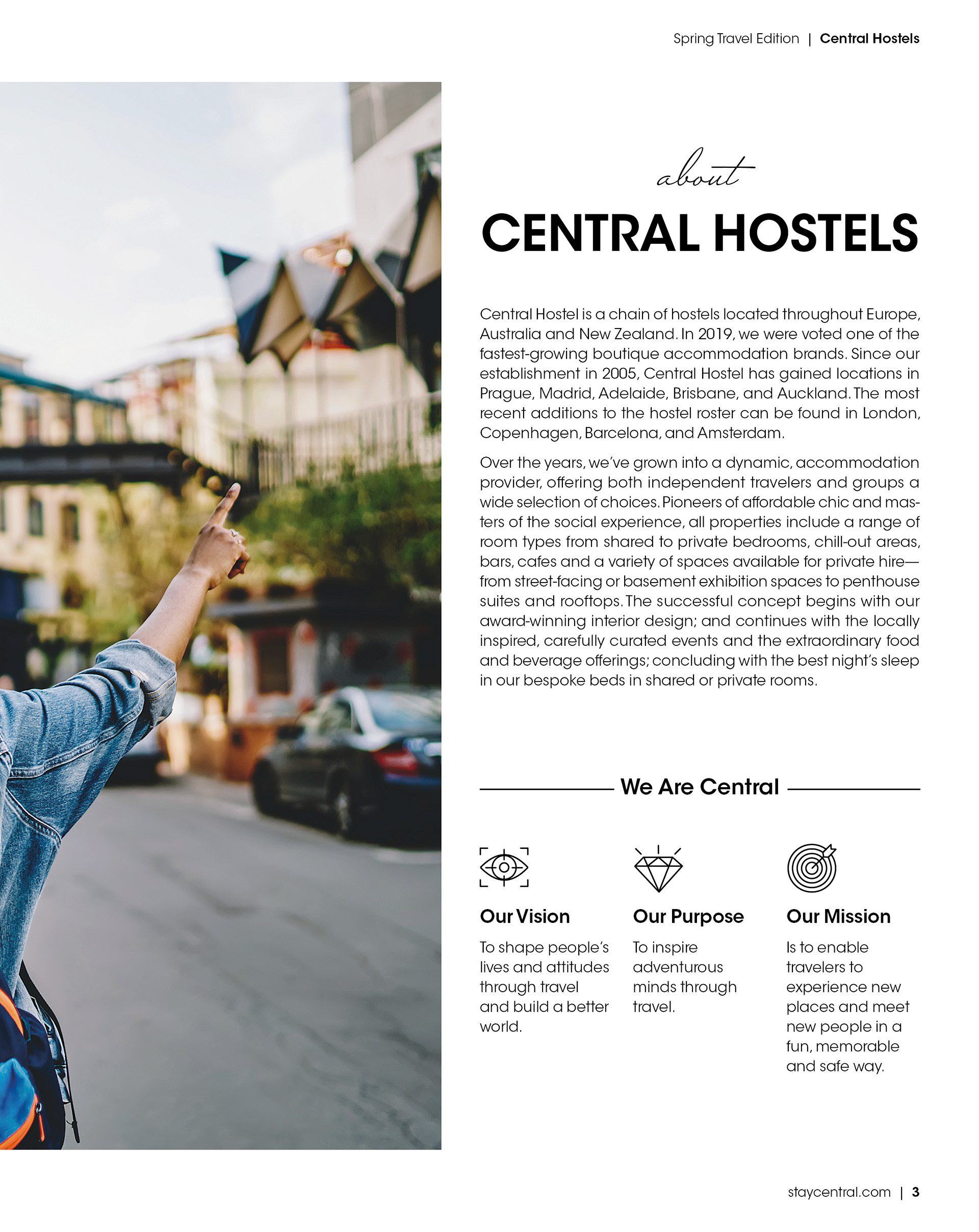
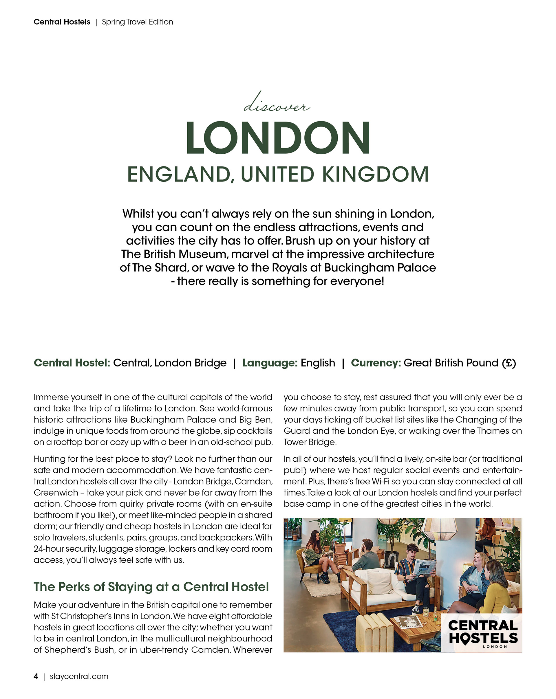
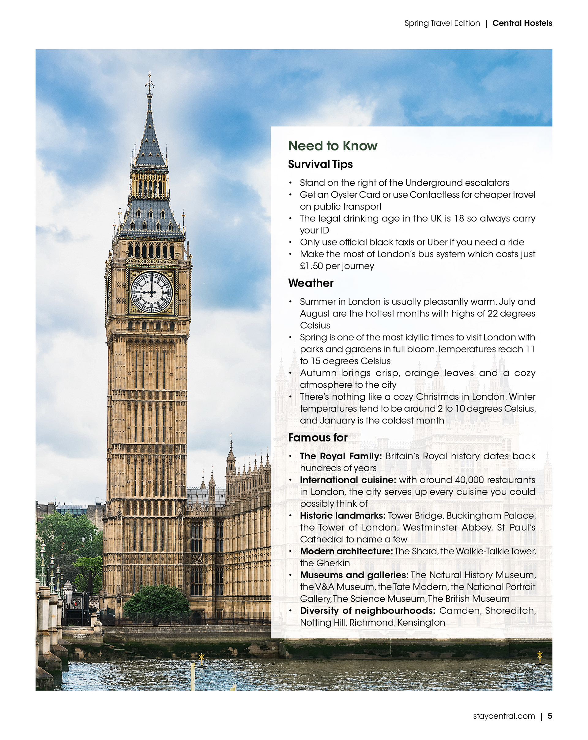
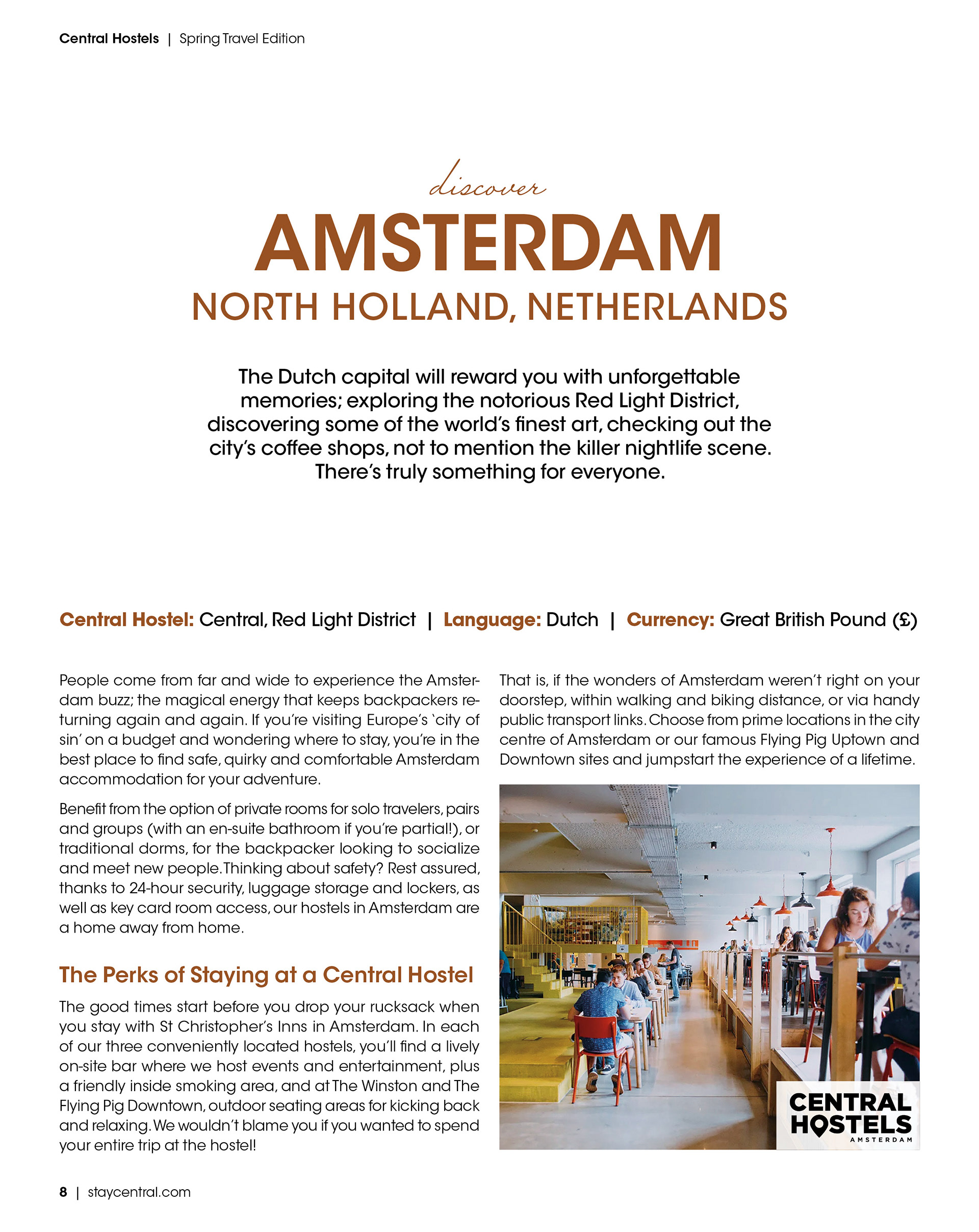
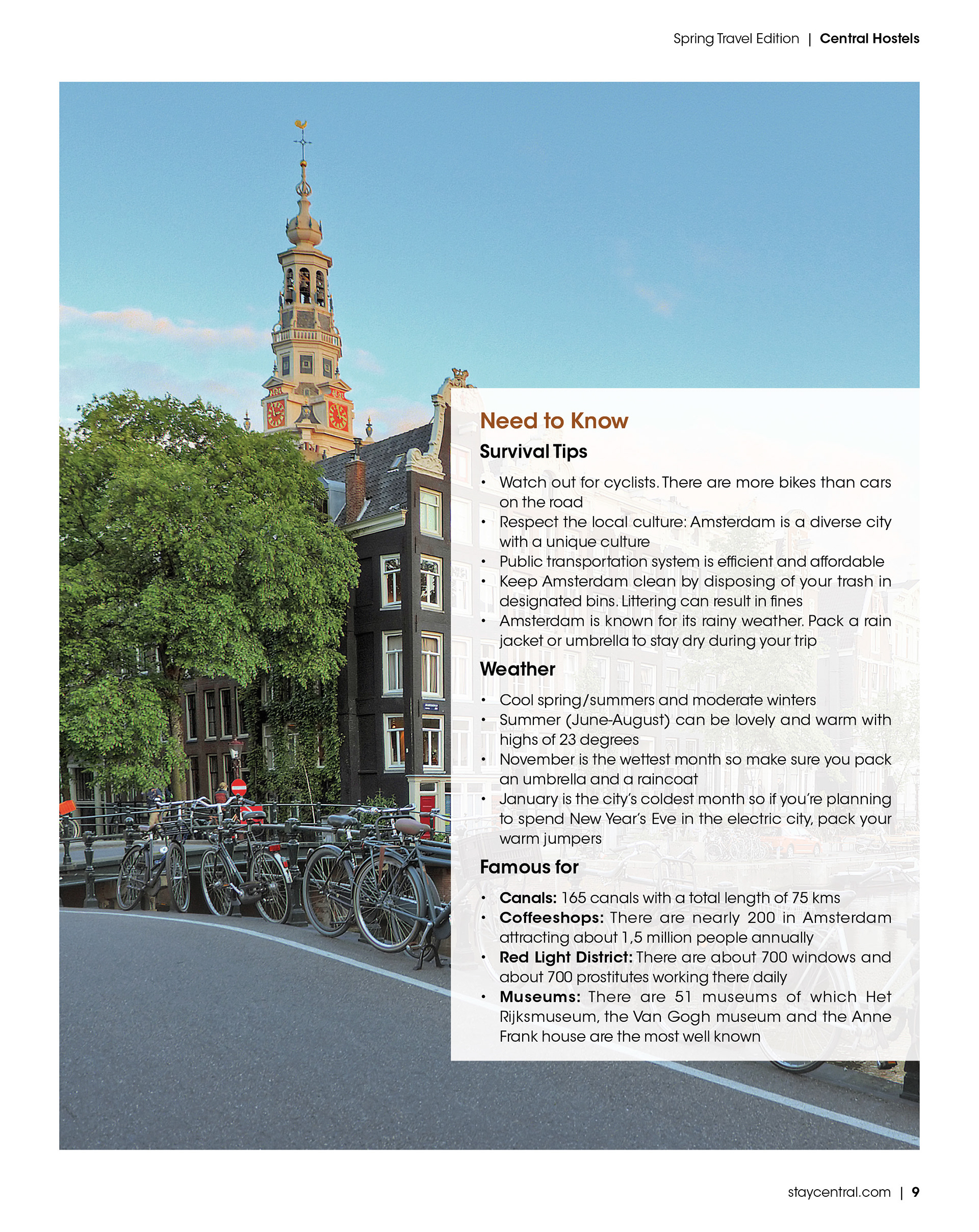
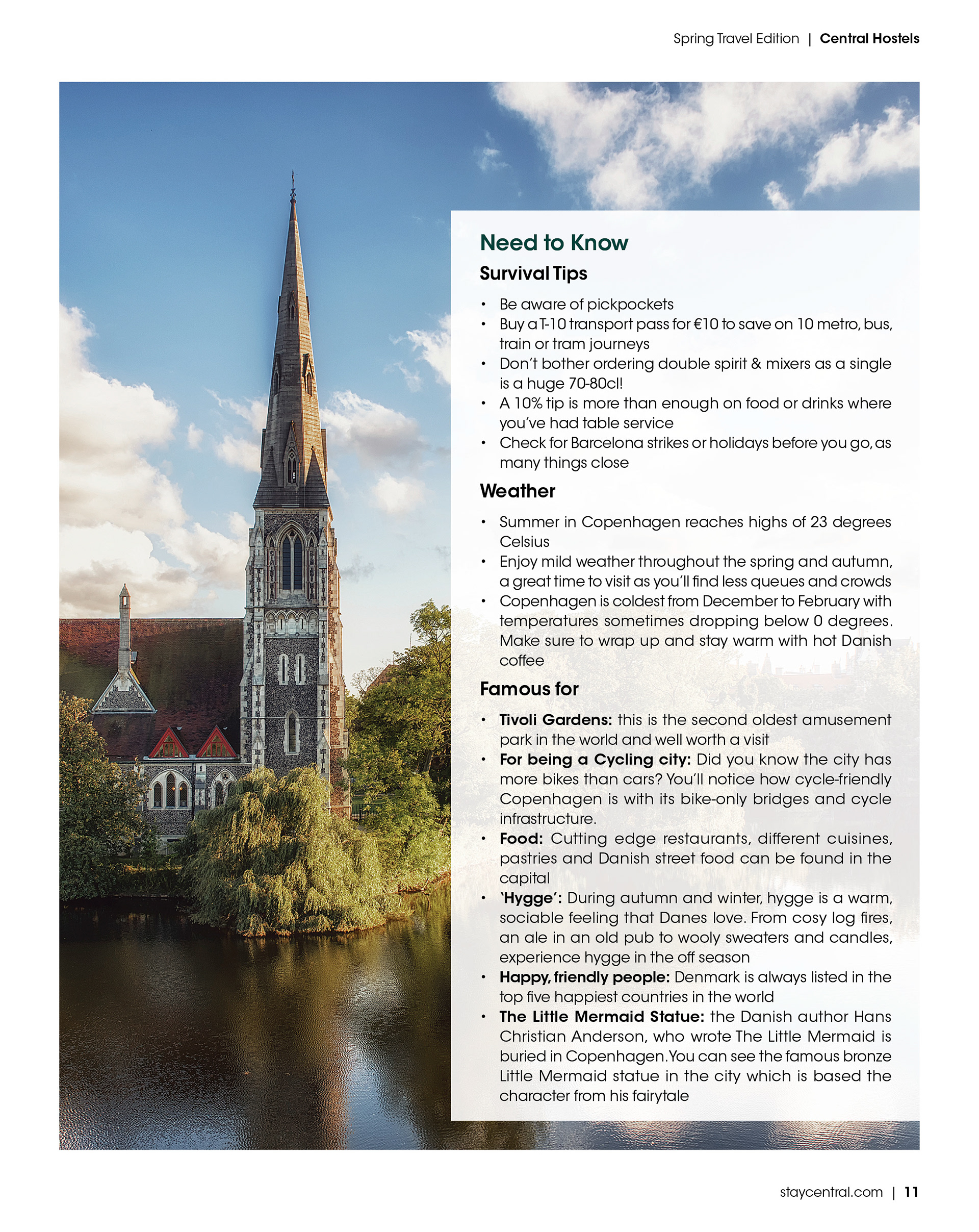
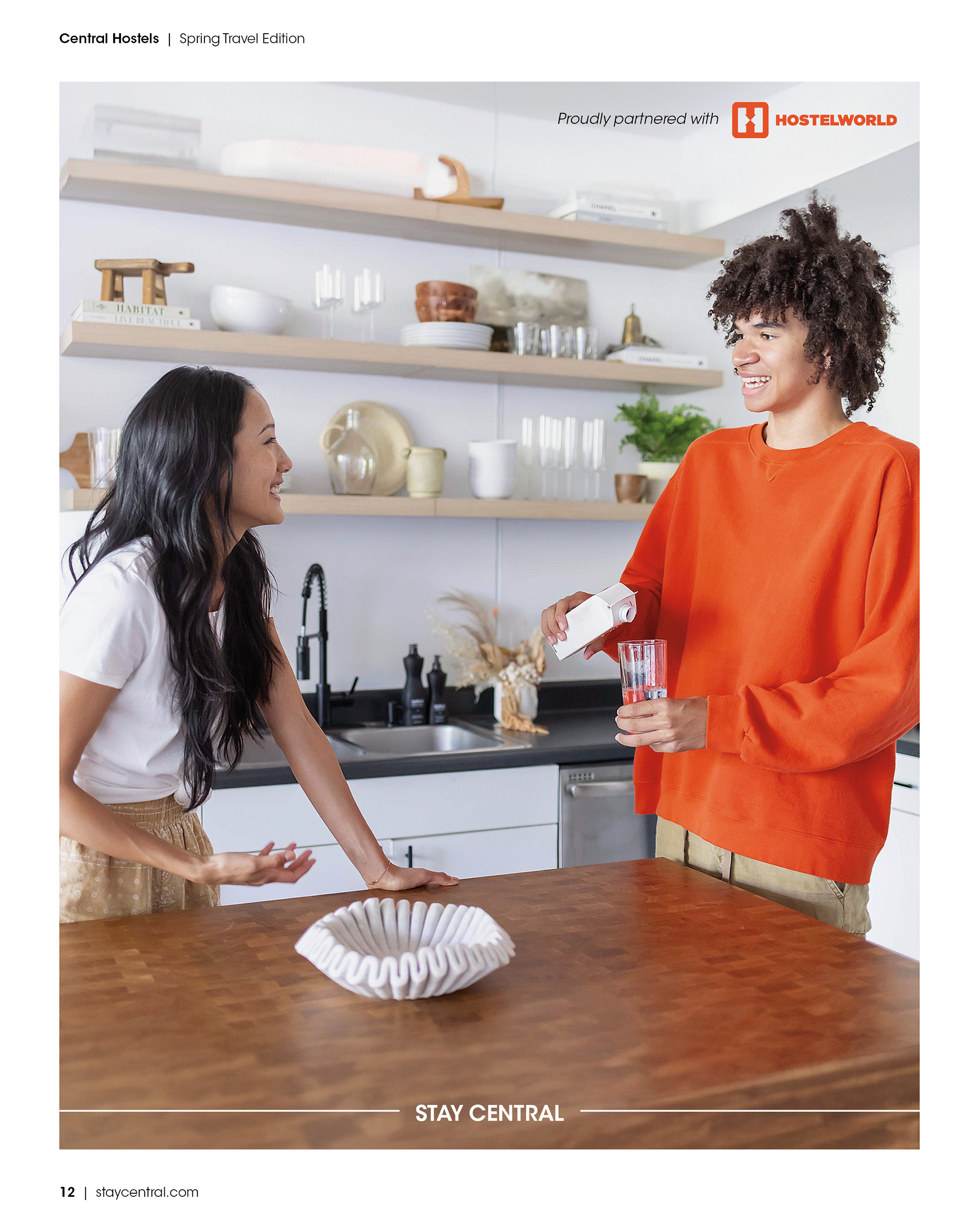
To wrap up the campaign, I created a magazine-style newsletter. Each of the locations (London, Barcelona, Amsterdam, and Copenhagen) had its own two-page spread featuring full-page landmark photography. I applied the same layout structure to all of them and adjusted the primary headings using each city's campaign colour for consistency. The icon pattern from the keycard holder was used again on the interior pages and back cover to reinforce the visual system. For the front cover, I placed the subject in front of the masthead to add a sense of depth. "Stay Central" was bolded in the subtitle to echo the digital ads, and I used a brand colour to highlight "Spring Travel Edition," creating balance and a clear seasonal tie-in.
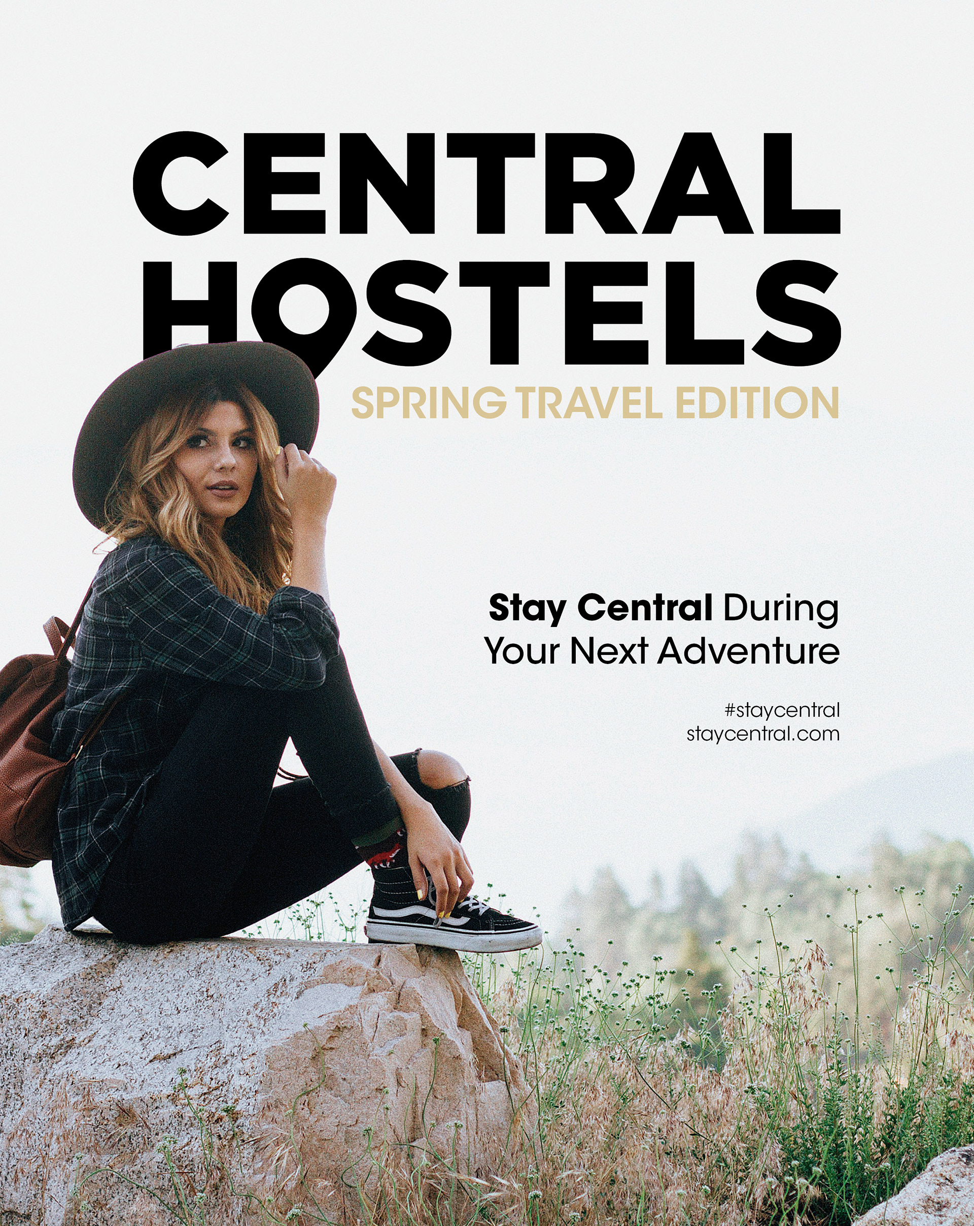
Cover (Front)

Cover (Front, Interior)
Page 1

Page 2
Page 3
Page 4
Page 5

Page 6

Page 7
Page 8
Page 9

Page 10
Page 11
Page 12

Cover (Back, Interior)

Cover (Back)
Summary
Looking back on this campaign, I’m proud of how the final assets came together. Each piece supports the others while still holding its own, creating a system that feels unified, flexible, and visually distinct. The designs successfully promoted Central Hostels’ newest locations in a way that was both bold and on-brand. Positive feedback from both peers and instructors affirmed the strength of the concept and reinforced the choices I made throughout the process.