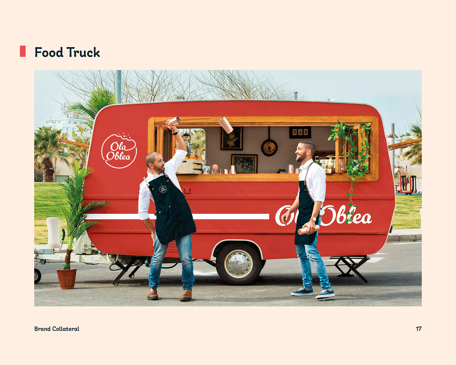
Ola Oblea Food Truck
Project Background
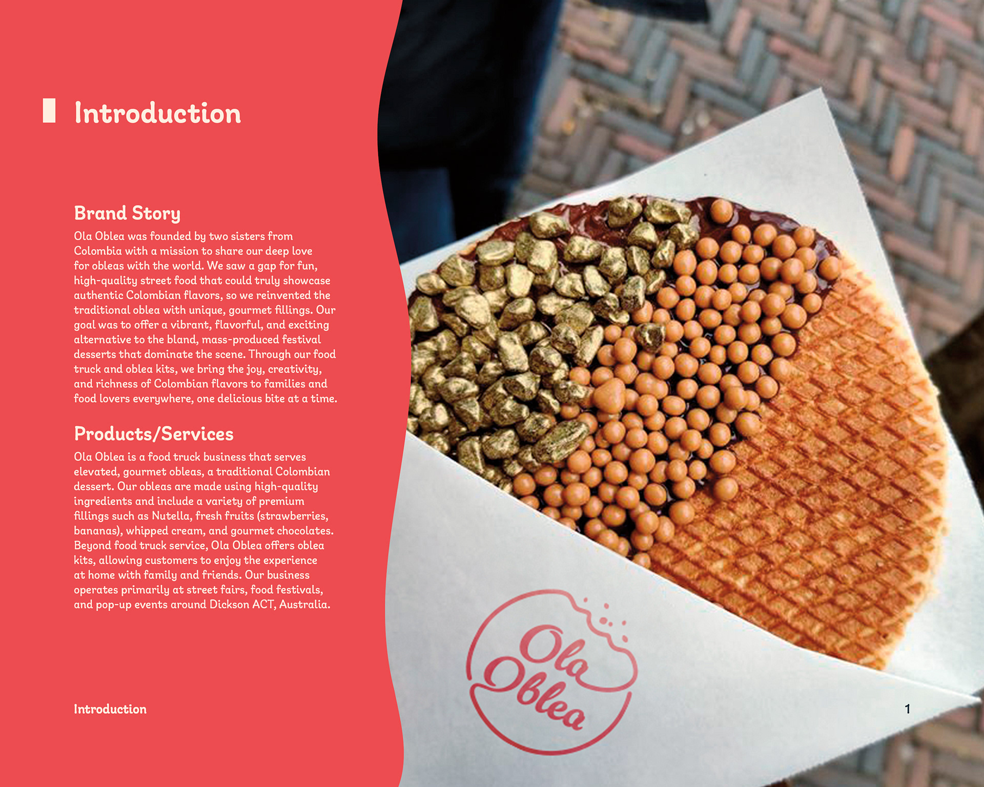
Ola Oblea is a food truck business that serves elevated, gourmet obleas, a traditional Colombian dessert. Their obleas are made using high-quality ingredients and include a variety of premium fillings such as Nutella, fresh fruits (strawberries, bananas), whipped cream, and gourmet chocolates. Beyond food truck service, Ola Oblea offers oblea kits, allowing customers to enjoy the experience at home with family and friends. The business operates primarily at street fairs, food festivals, and pop-up events around Dickson ACT, Australia.

Ola Oblea Stylescape
Ola Oblea positions itself as a premium street food vendor, offering an authentic yet elevated version of a traditional Colombian dessert. With its focus on high-quality ingredients and unique gourmet fillings, the brand stands out from typical street vendors by providing a special culinary experience at local events and festivals.
Despite its strong local brand presence, Ola Oblea had a weak visual identity that didn't stand out amongst the crowded streets of its frequented events. The brand's awareness was also fairly limited to the area, and they were hoping to expand their reach with a new look.
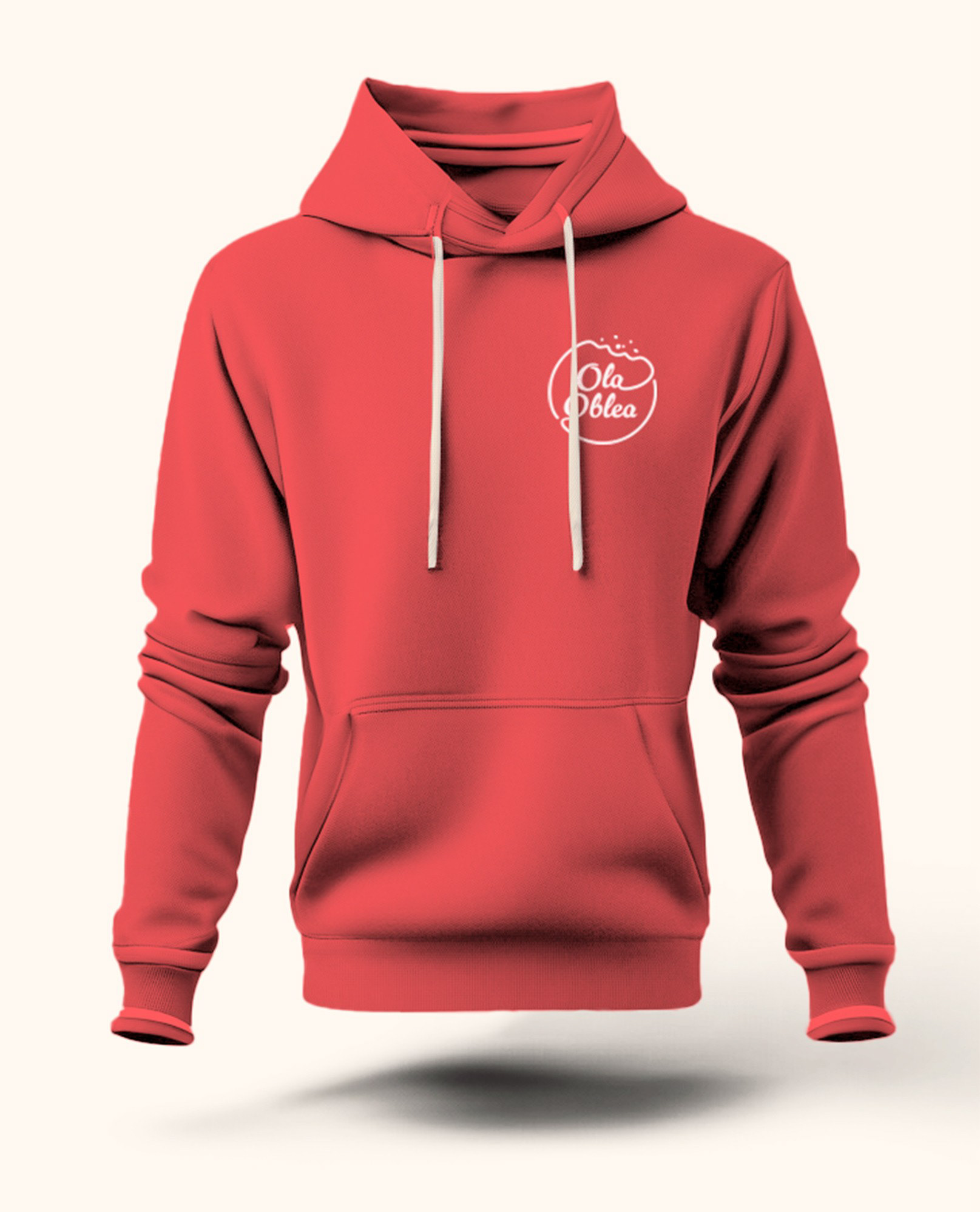
Ola Oblea Employee Hoodie
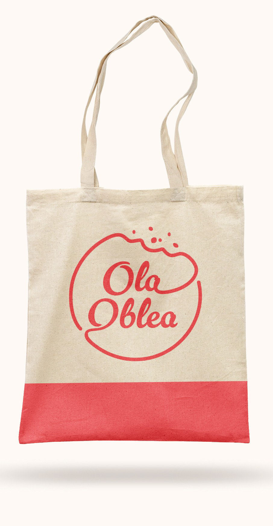
Ola Oblea Tote Bag
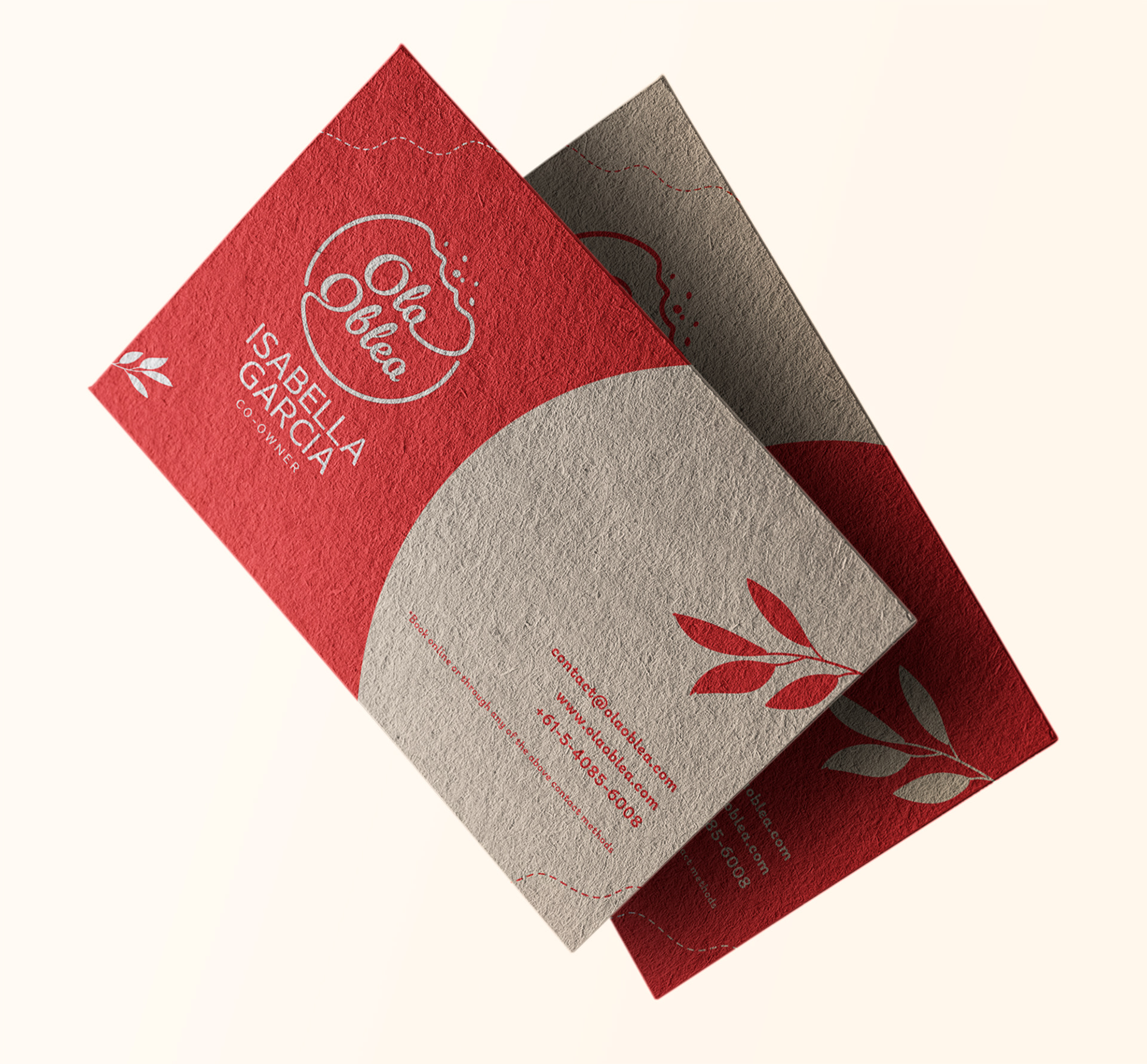
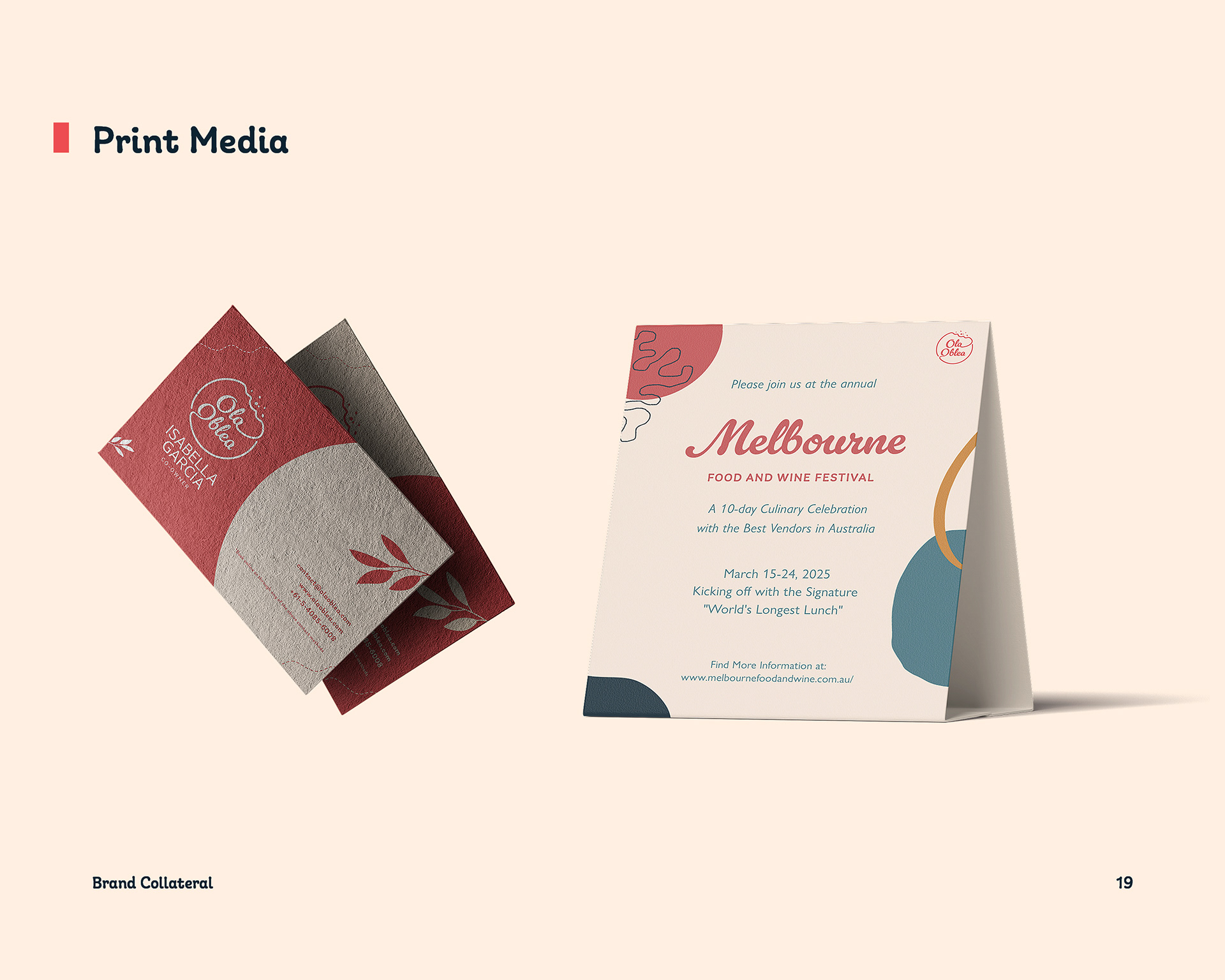
Ola Oblea Business Cards
Obstacle & Approach
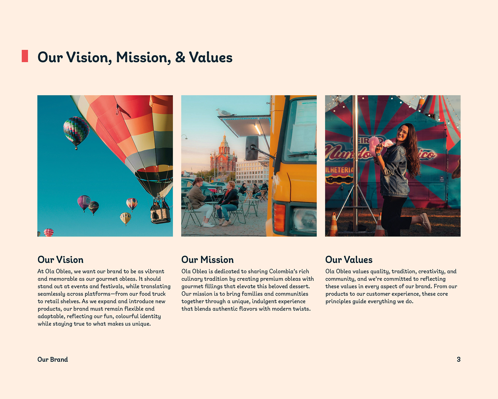
The primary goal of this project was to rebrand Ola Oblea (formerly "Hola Oblea") with a more memorable, professional, and fun identity that reflected the vibrant nature of their gourmet obleas. The new brand needed to stand out at events and festivals while remaining adaptable as the business expanded. It also had to work across a range of platforms, from food trucks to retail kits.
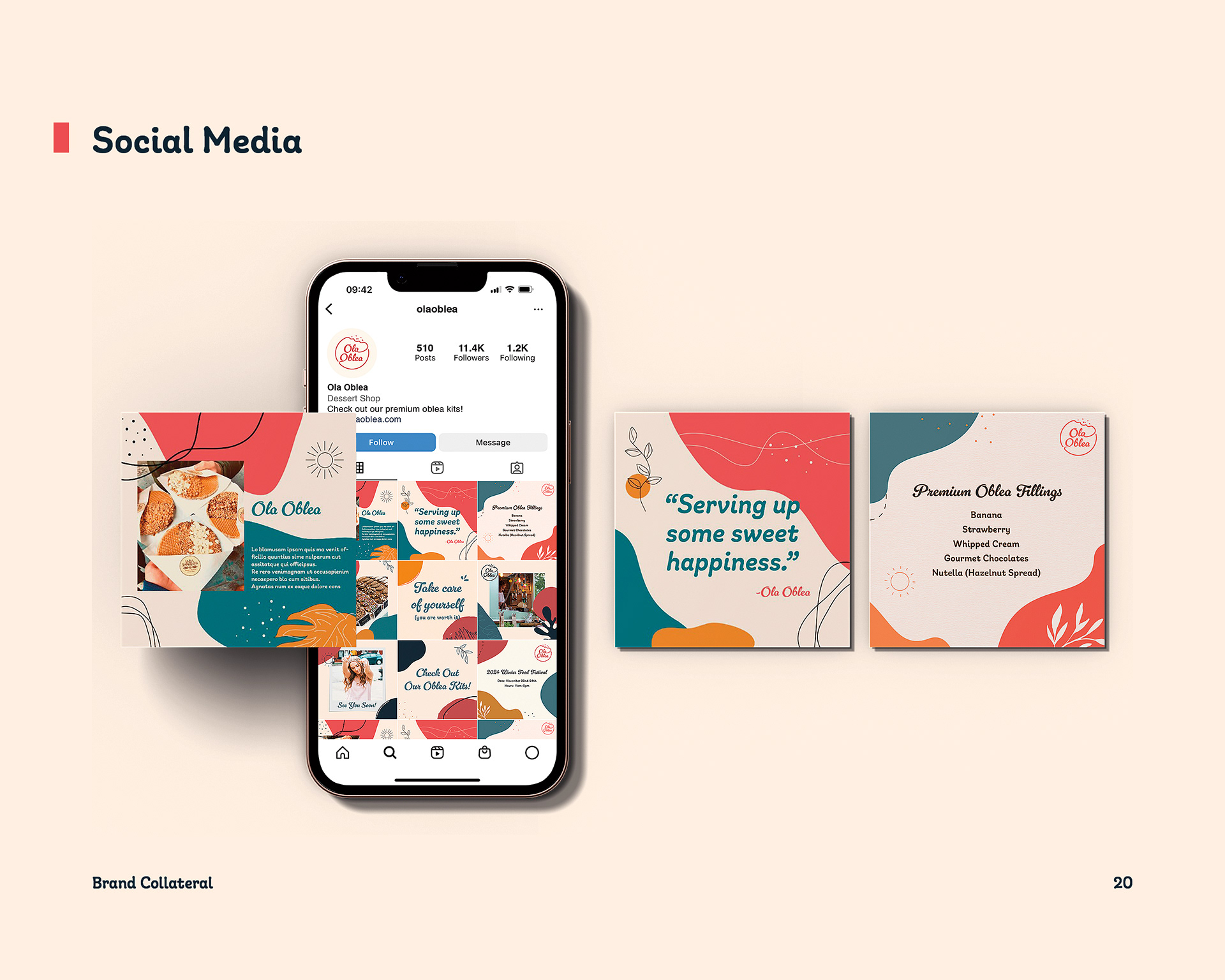
The deliverables included a logo suite, colour palette, typography system, brand guidelines, marketing collateral, and social media assets. I started by analyzing the client brief and building a stylescape to communicate the intended direction. Gathering references like logos, posters, and colour palettes, I focused on combining modern structure with vibrant energy to match the client’s goals and target audience. One of the early challenges was laying out the stylescape in a way that clearly conveyed the brand voice. It took a few rounds of refinement to make sure the layout felt both inspiring and on-brand. My final stylescape was chosen from a pool of about ten, selected for its clarity and alignment with the client’s vision for the company.
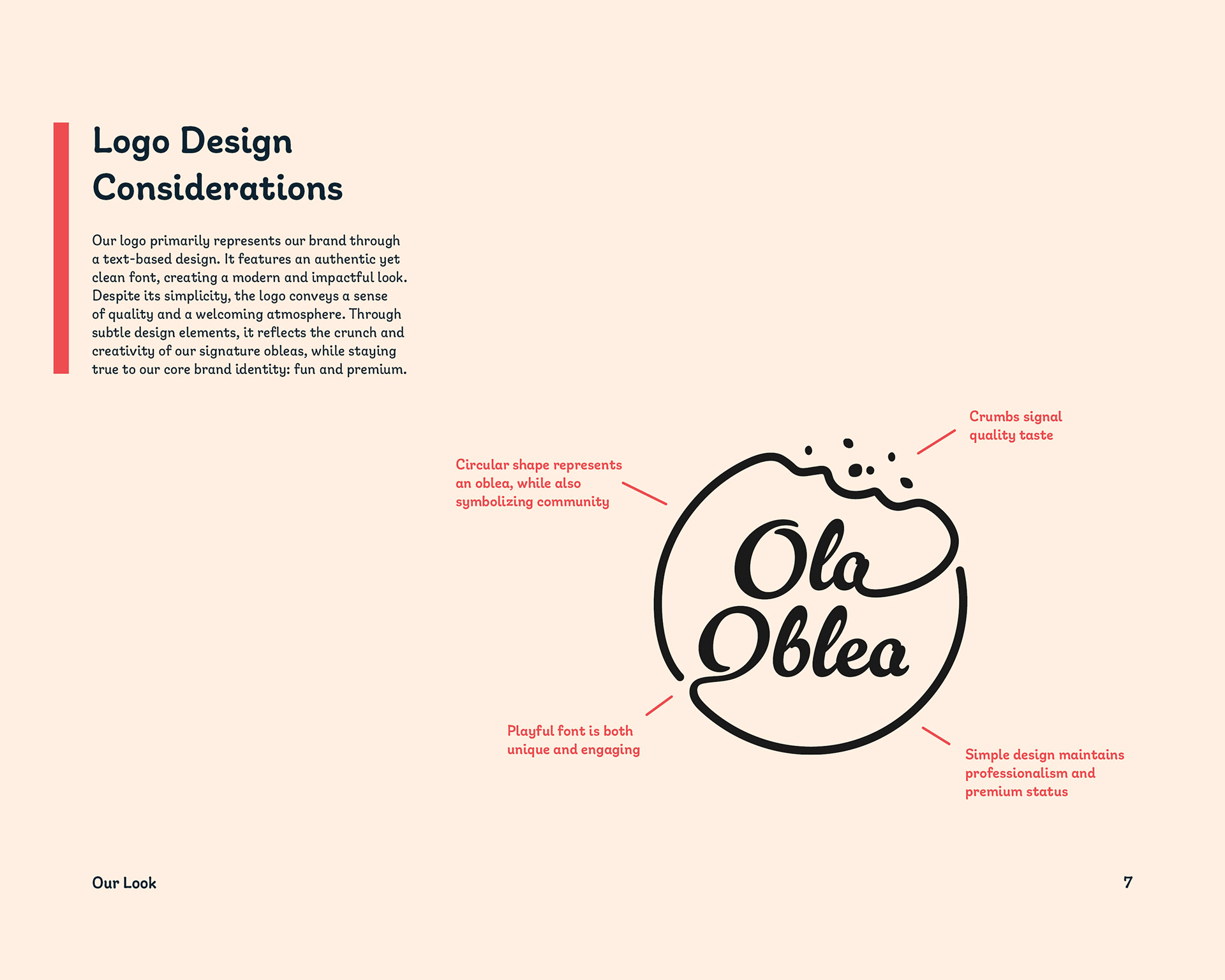
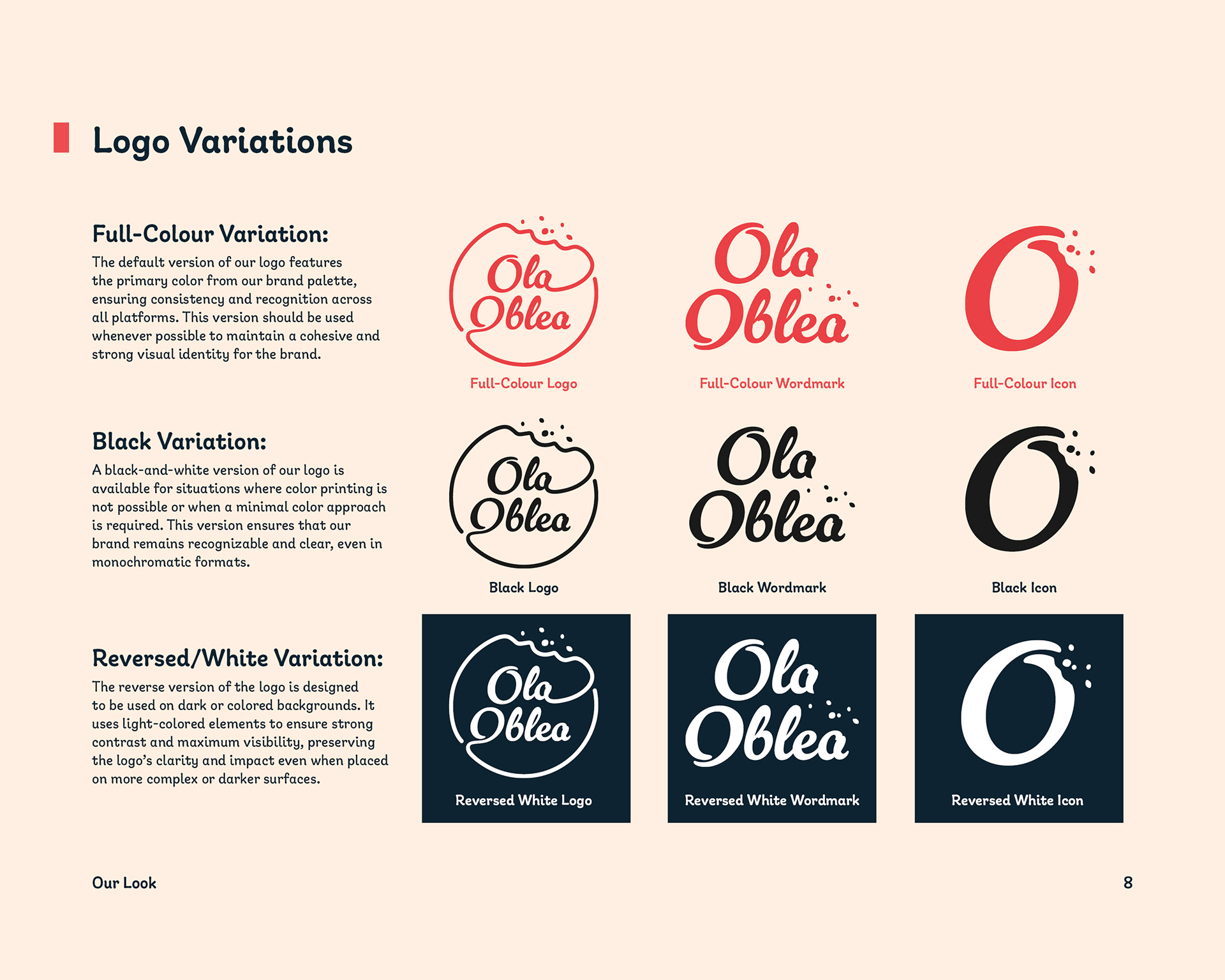
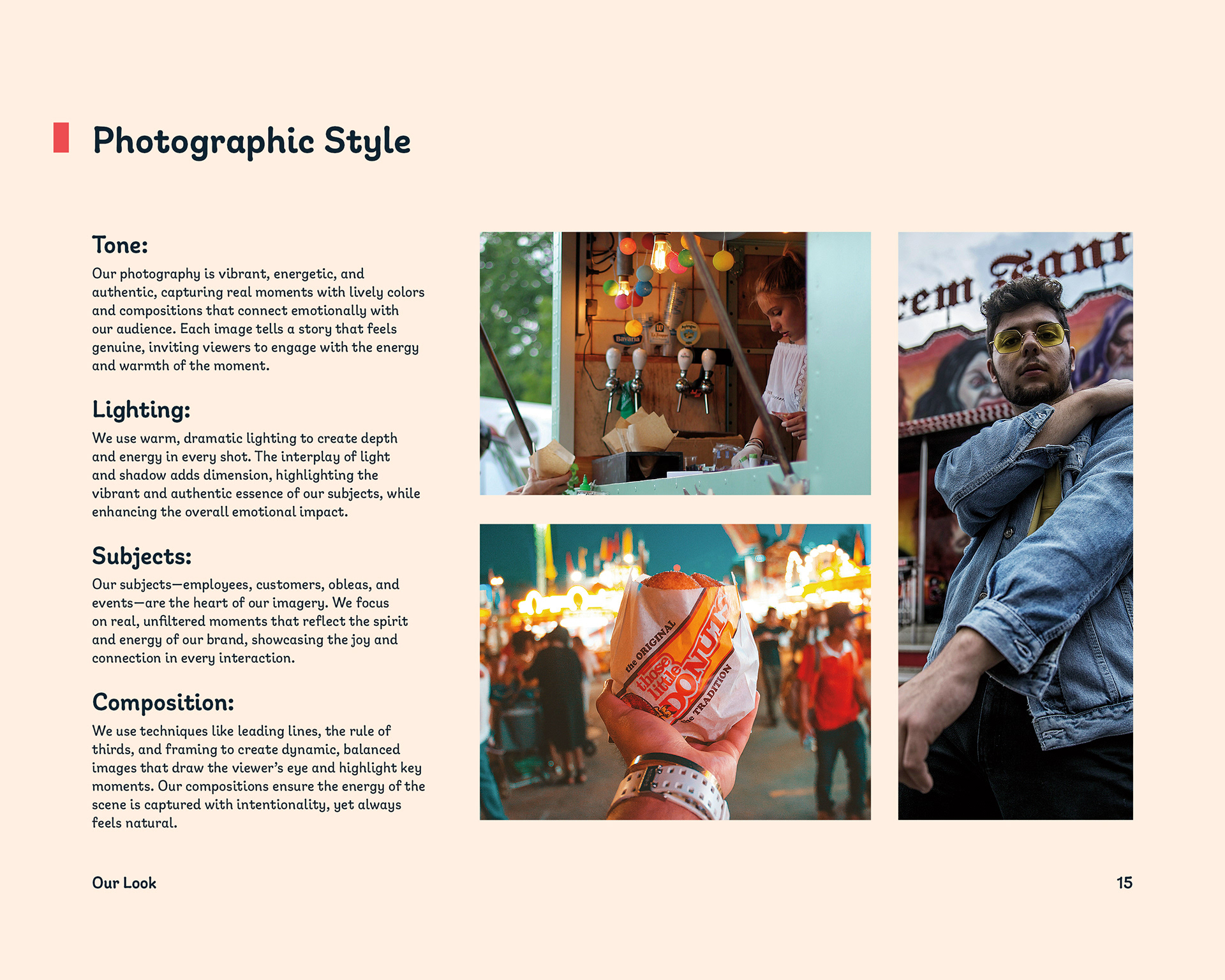
The logo design required multiple rounds of exploration. Many early concepts included literal illustrations of obleas, but they started to feel too obvious and lacked the flexibility the brand needed. Through testing and feedback, I found that a cleaner, more abstract direction captured the essence of the product more effectively while allowing the identity to grow with the brand. I brought in soft, rounded typography and a mix of bold, freeform shapes to give the system a sense of whimsy and energy.
The final marketing collateral reflects this playful tone while remaining professional. When assembling the brand guidelines, I kept the design clean and easy to navigate, ensuring the client could apply the system confidently across future applications.

Ola Oblea Brand Guide Book
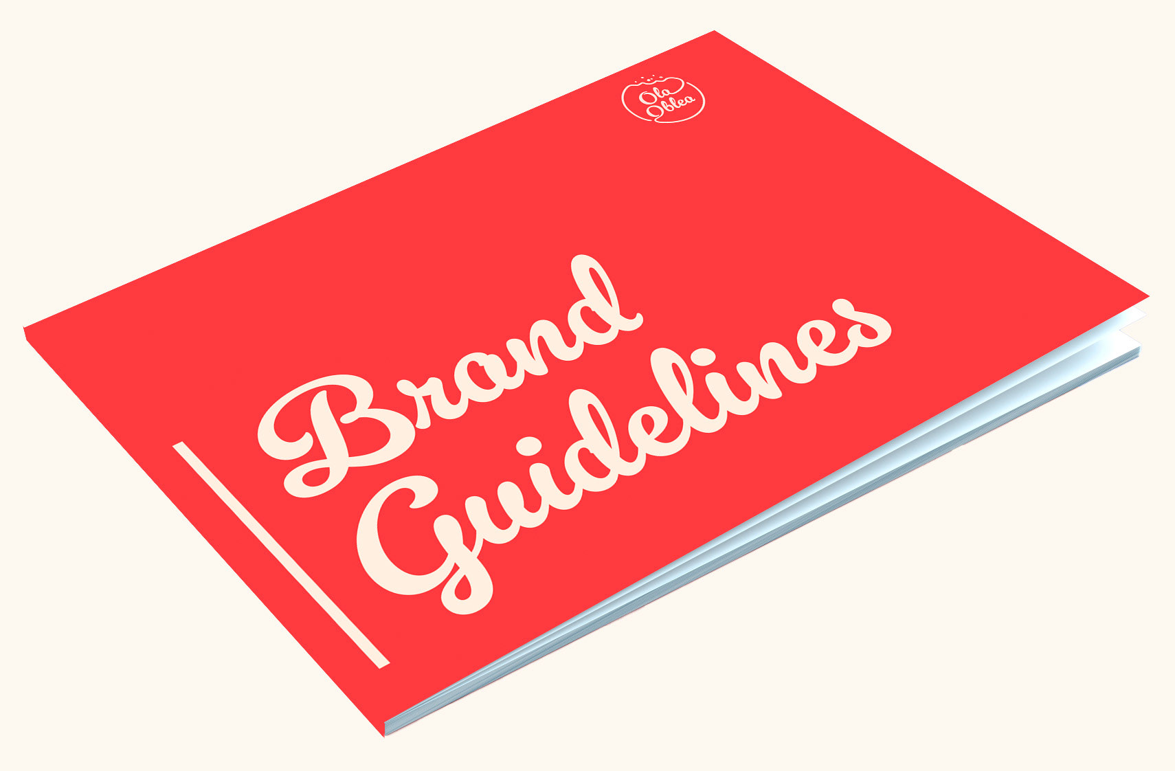
Ola Oblea Brand Guide Book (Cover)

Front Cover
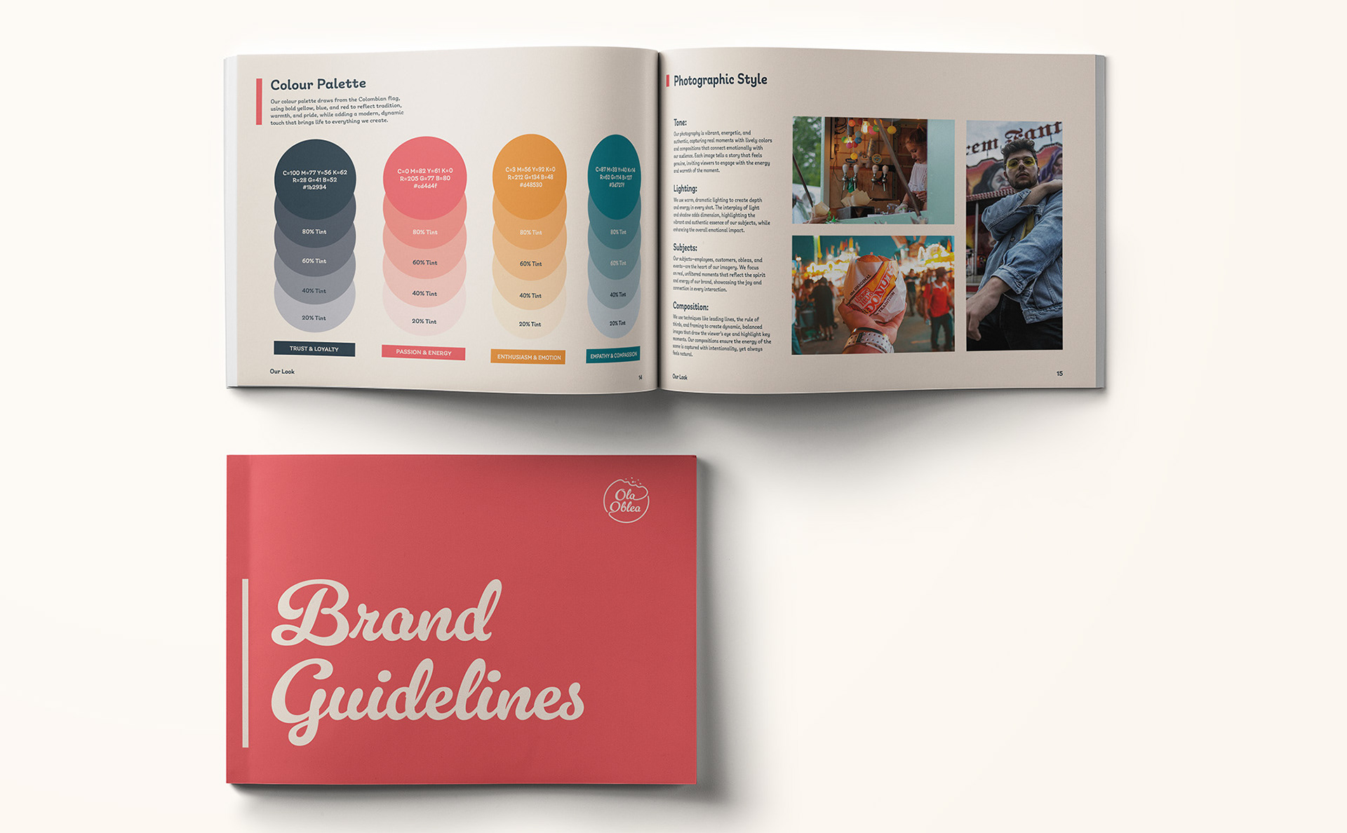
Table of Contents
Page 1

Page 2
Page 3
Page 4

Page 5

Page 6
Page 7
Page 8

Page 9
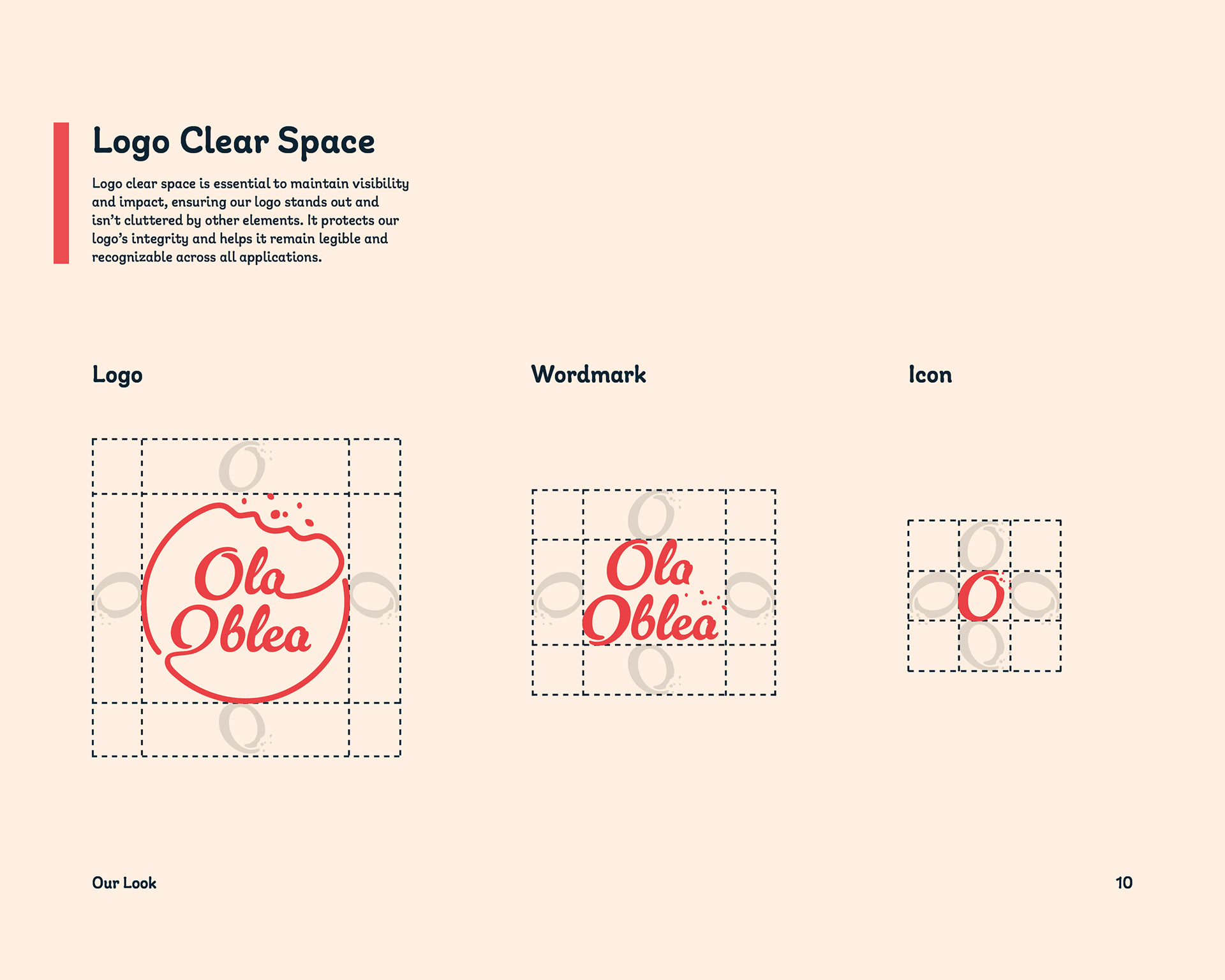
Page 10
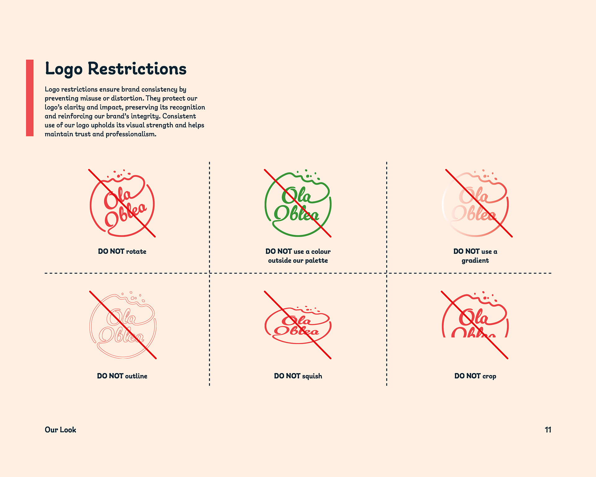
Page 11
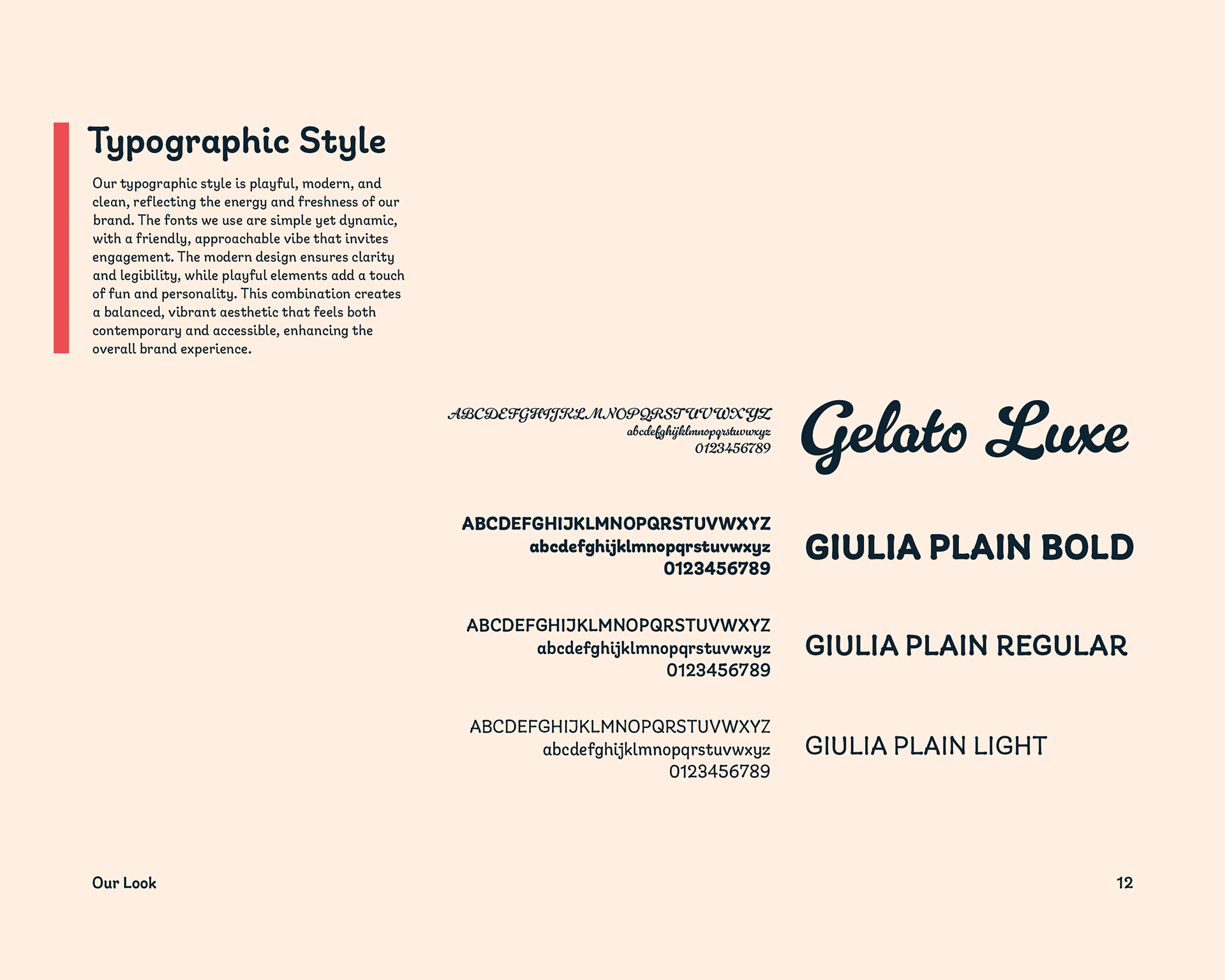
Page 12

Page 13
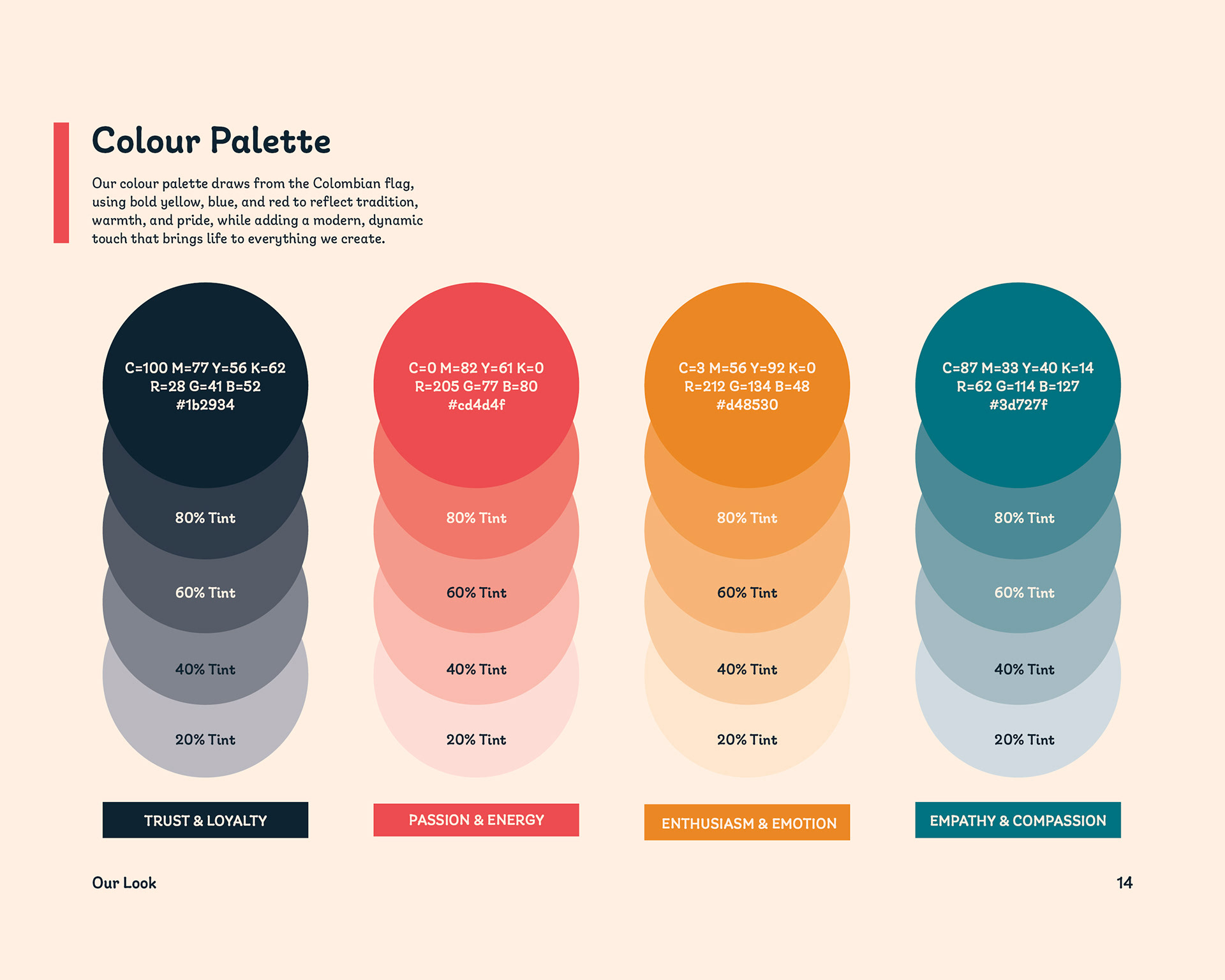
Page 14
Page 15

Page 16
Page 17

Page 18
Page 19
Page 20

Page 21

Back Cover
Summary
The rebrand of Ola Oblea focused on blending vibrant Colombian cultural elements with modern design principles to create a fresh, dynamic identity. The updated visual identity enhances the brand’s overall experience, combining bold colours and contemporary design to reflect the fun, energetic vibe of the food truck. With a sleek new logo, a cohesive colour palette, and modernized marketing collateral, the rebrand successfully communicates Ola Oblea’s unique blend of traditional Colombian flavours and a modern street food experience. The refreshed brand now stands out as a vibrant and memorable presence, appealing to both loyal customers and new audiences alike.