Project Background
This project involved designing the 2023 Annual Report for the City of Vancouver. The report was created to meet public transparency requirements and serve as a financial auditing document. I was given a comprehensive Visual Standards Guide and a strict set of content and layout specifications, which meant working within tight constraints while still delivering a design that felt cohesive, thoughtful, and engaging.
Visual Standards Guide - Front Cover
Visual Standards Guide - Page 1
Visual Standards Guide - Page 2
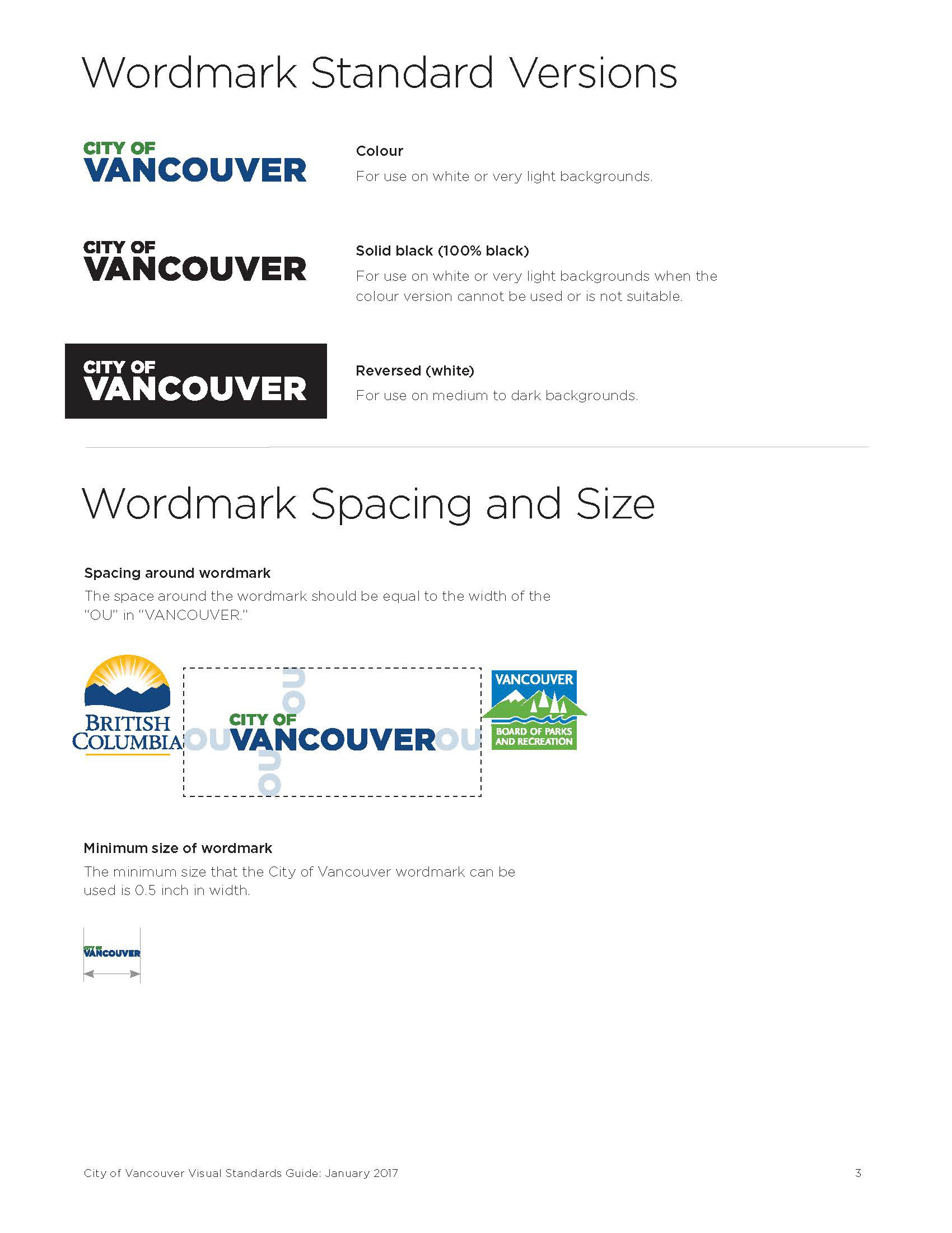
Visual Standards Guide - Page 3
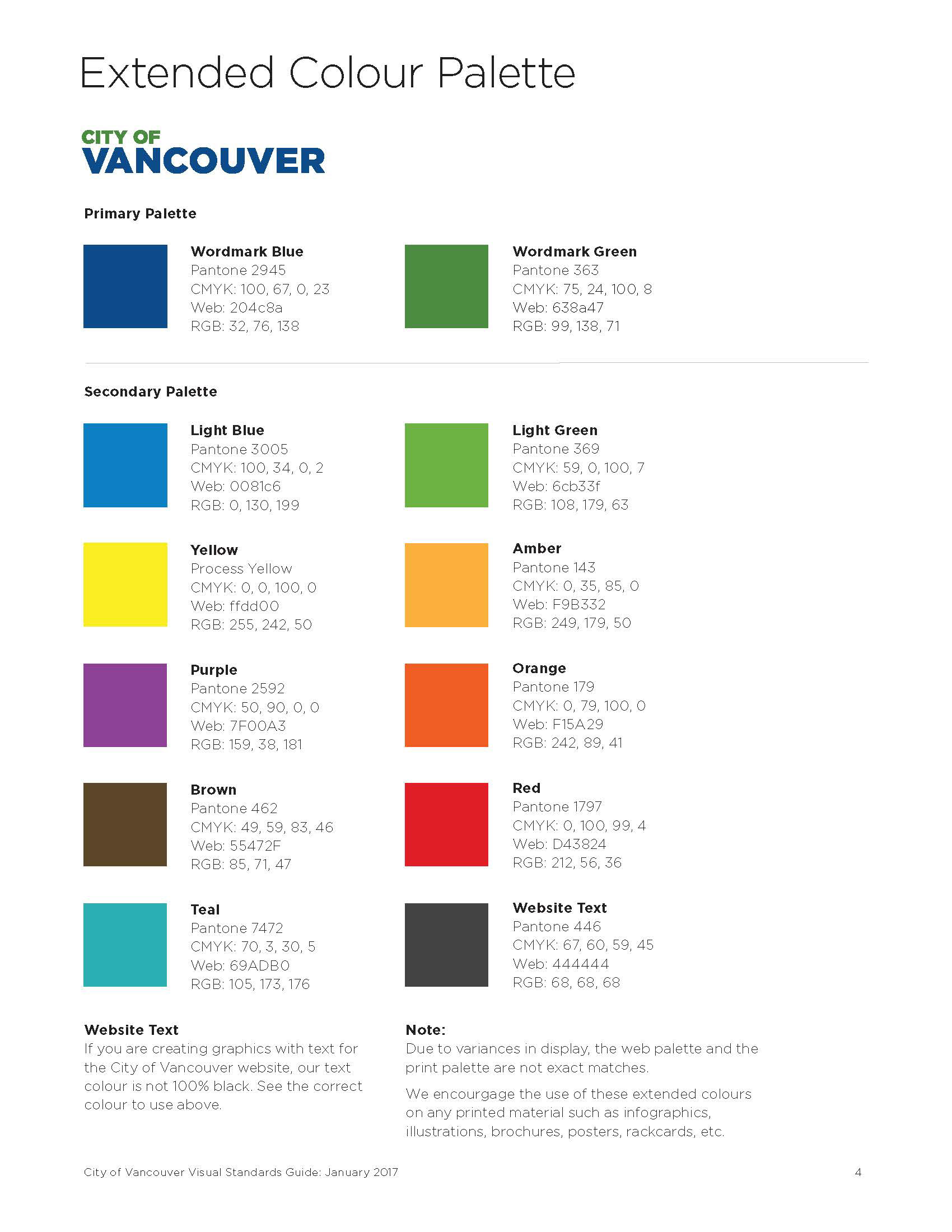
Visual Standards Guide - Page 4
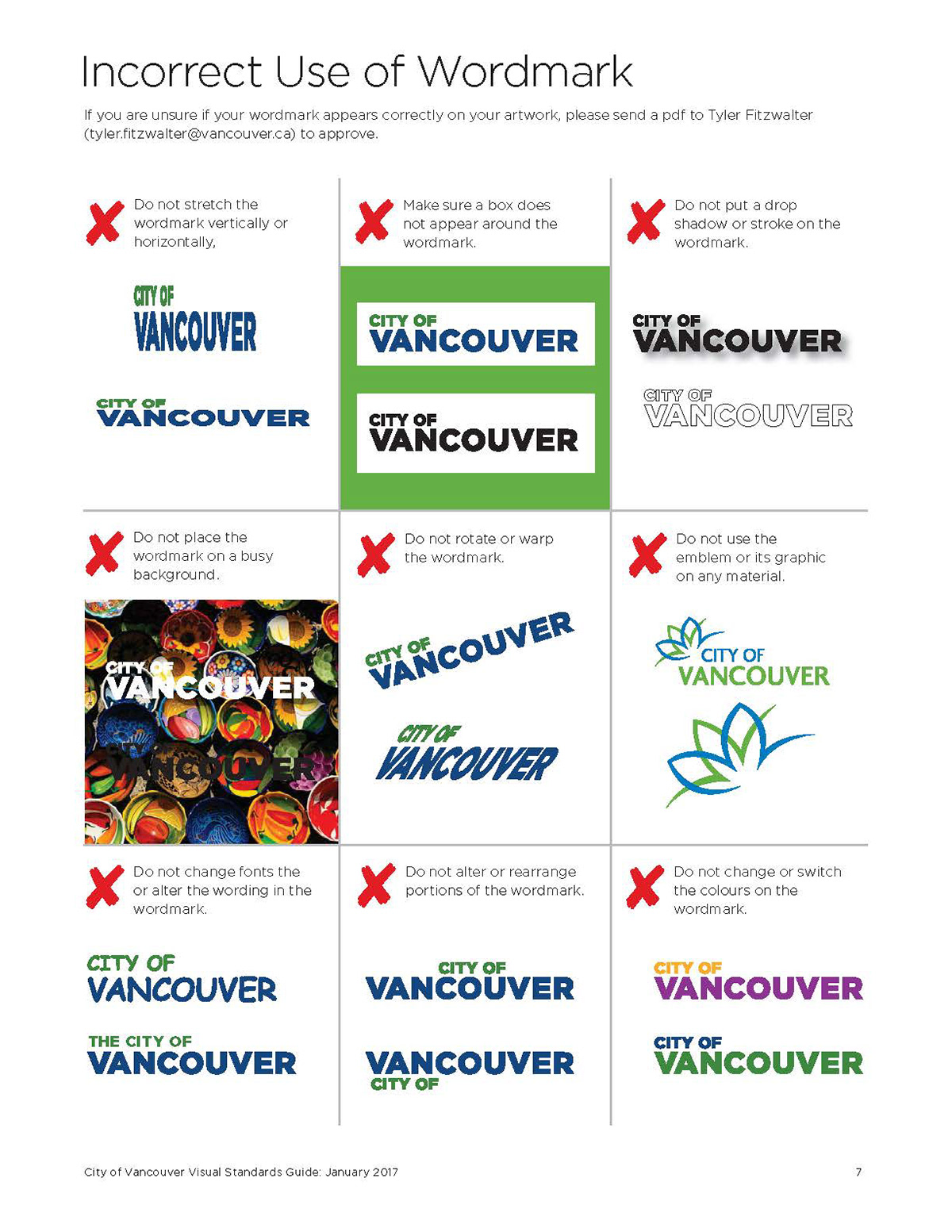
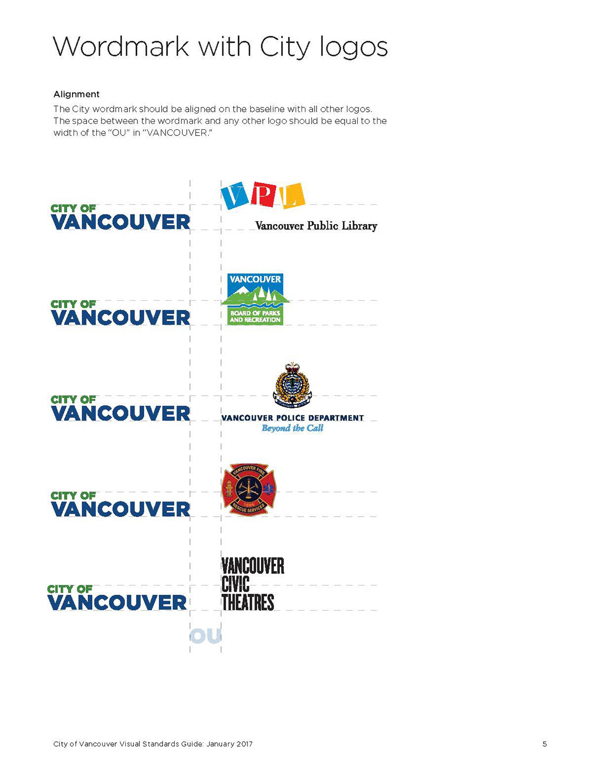
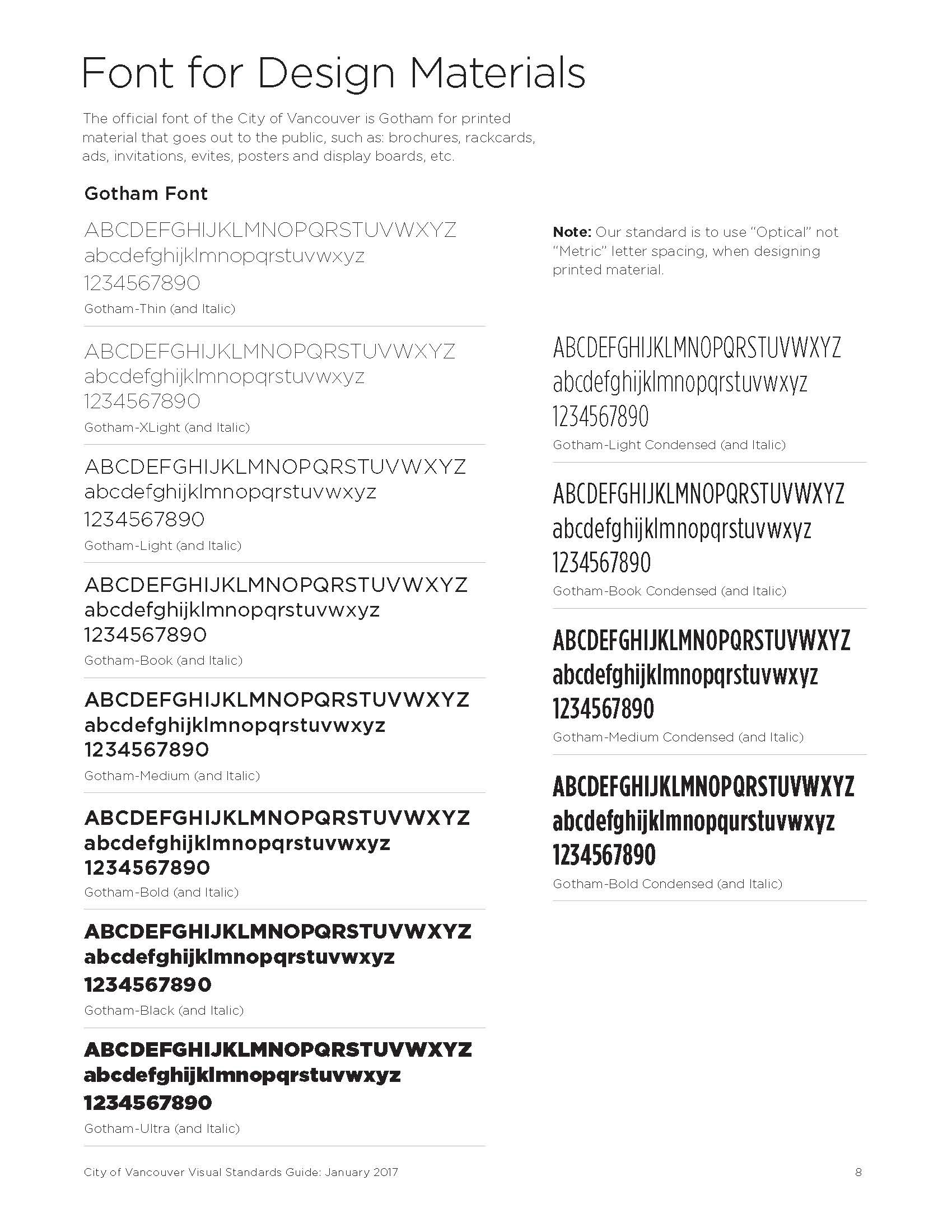
Visual Standards Guide - Page 5
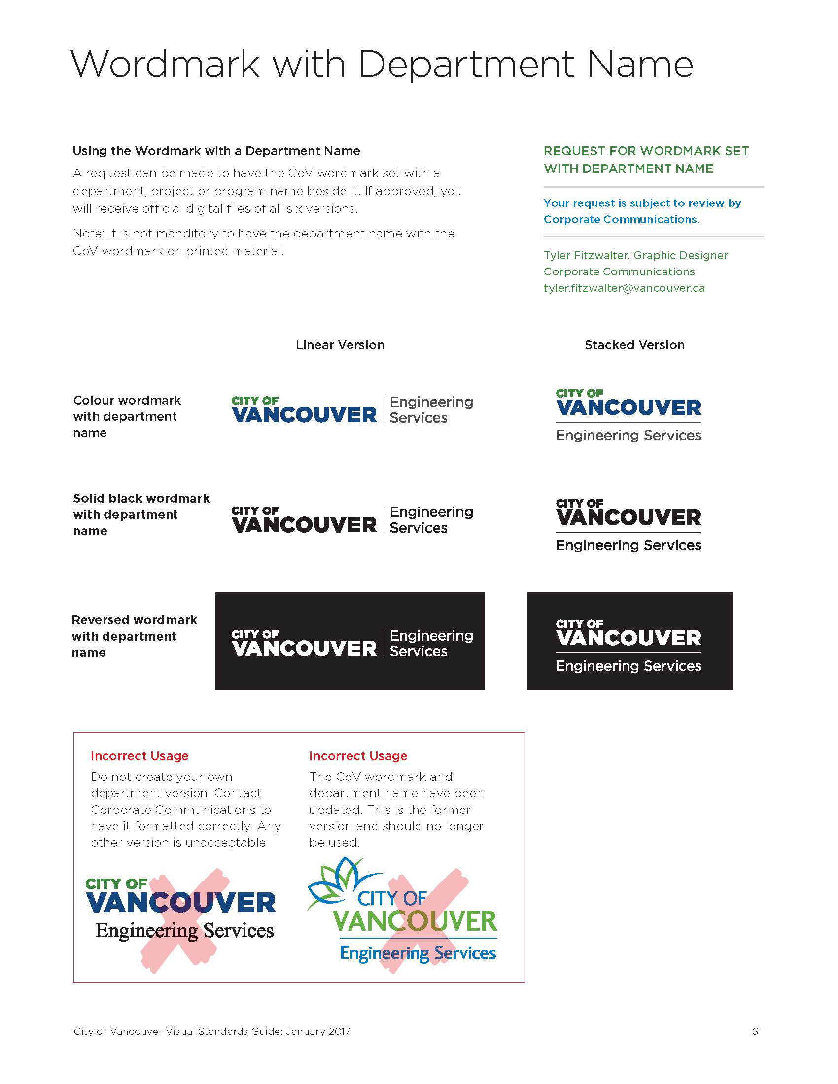
Visual Standards Guide - Page 6

Visual Standards Guide - Back Cover
Obstacle & Approach
The biggest challenge was working within a strict framework while still producing something that felt intentional and well-designed. Every page had detailed rules around what went where, which meant most of the creative thinking had to happen within the layout and flow.
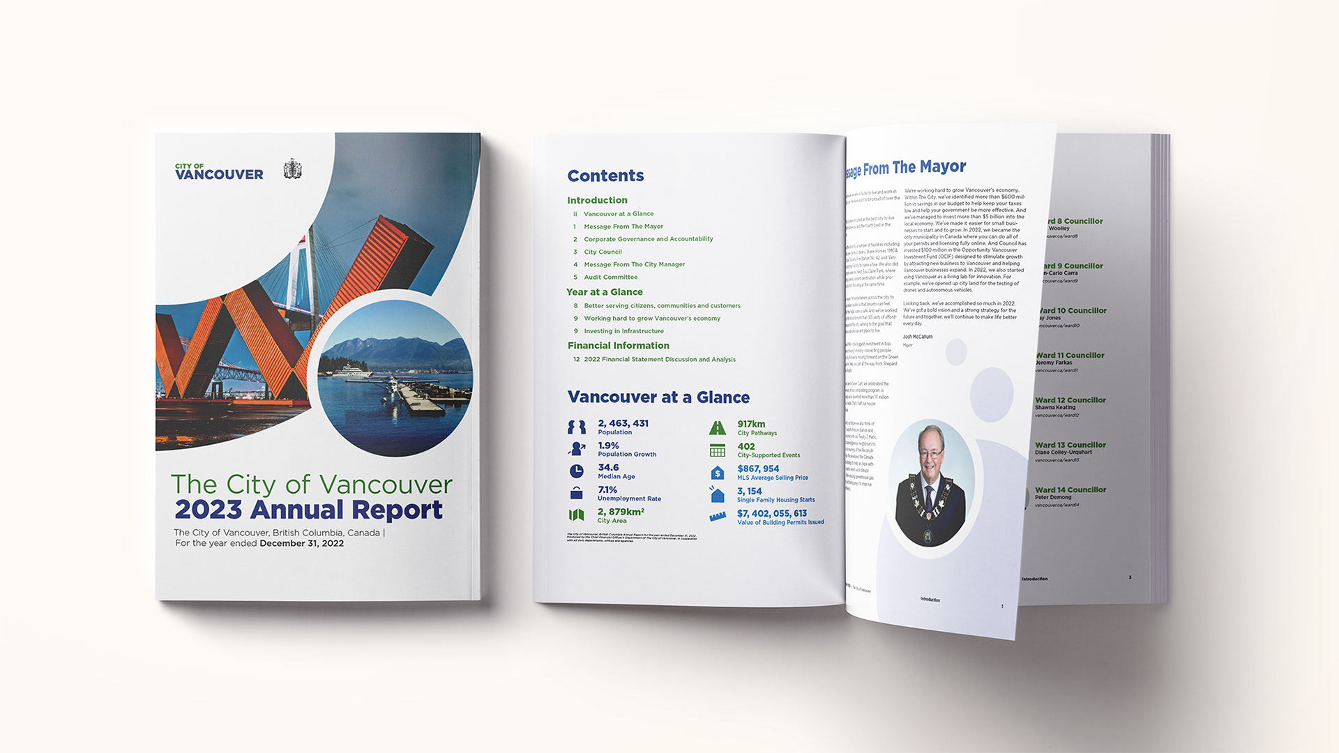
I started by sketching out the report to get a sense of how to pace the content. My first versions felt a bit stiff, so I took a step back and thought about how to make the report feel more welcoming. I introduced rounder curves and circular shapes to soften the tone and add a quiet sense of optimism. These elements became subtle cues throughout the design that helped bring a sense of progress and opportunity to an otherwise formal document.
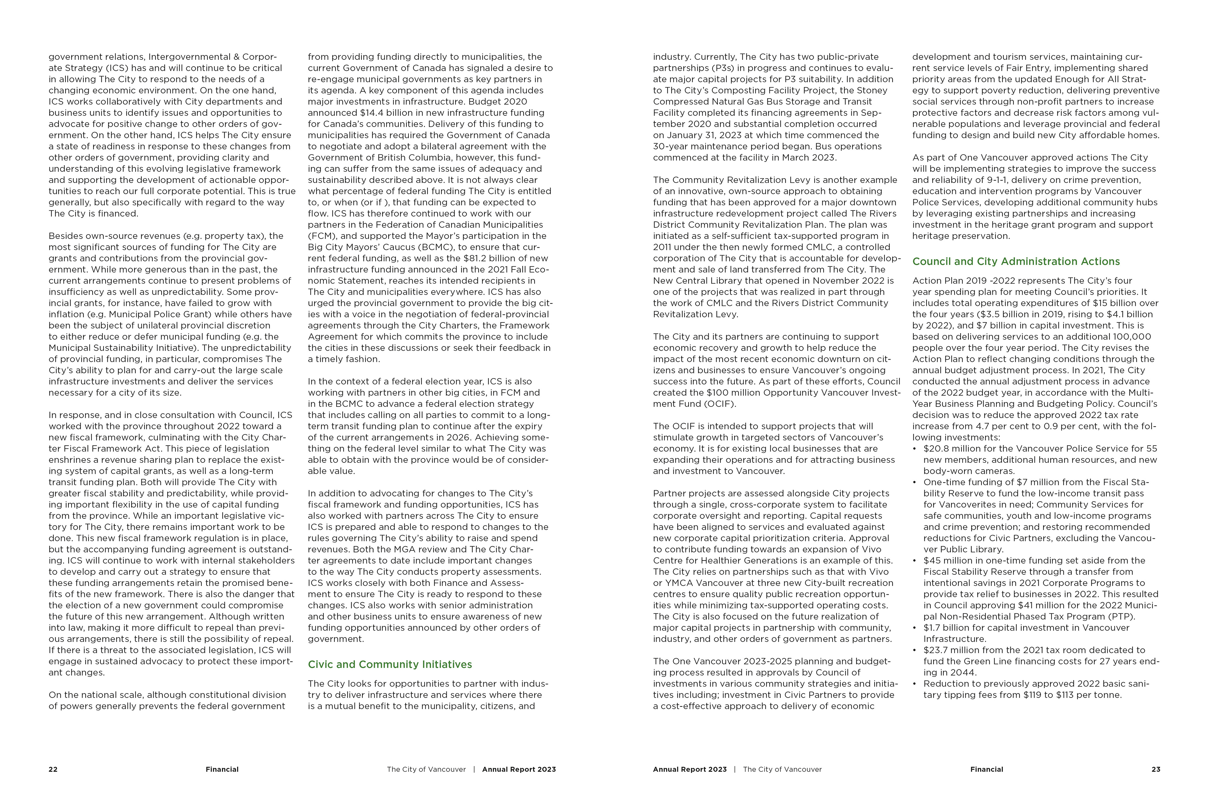
My background in business and accounting helped a lot when formatting the financial sections. I understood the importance of clarity in these areas and kept the design minimal, letting the data stay focal while making sure it felt structured and balanced.
I also spent time iterating on the infographics. I explored different visual directions until I landed on a style that felt clean, easy to follow, and aligned with the rest of the report. The goal was always to support the content, not distract from it.
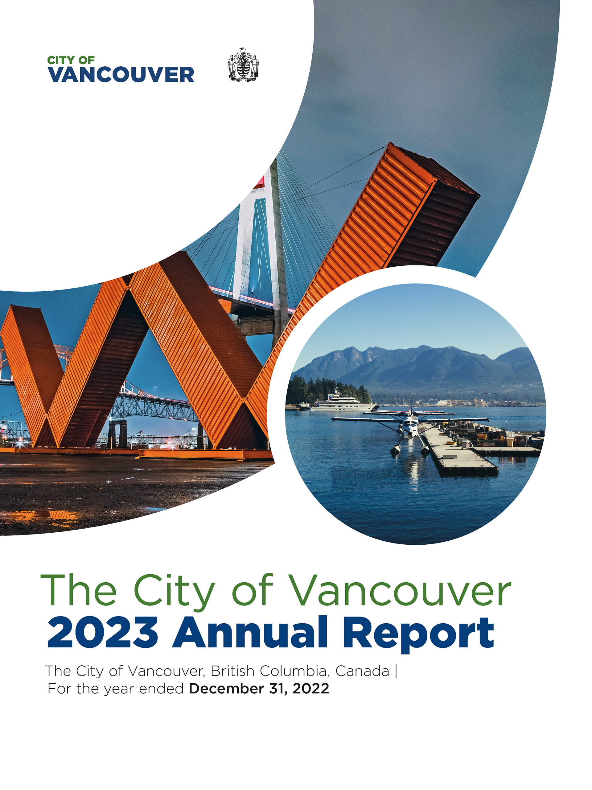
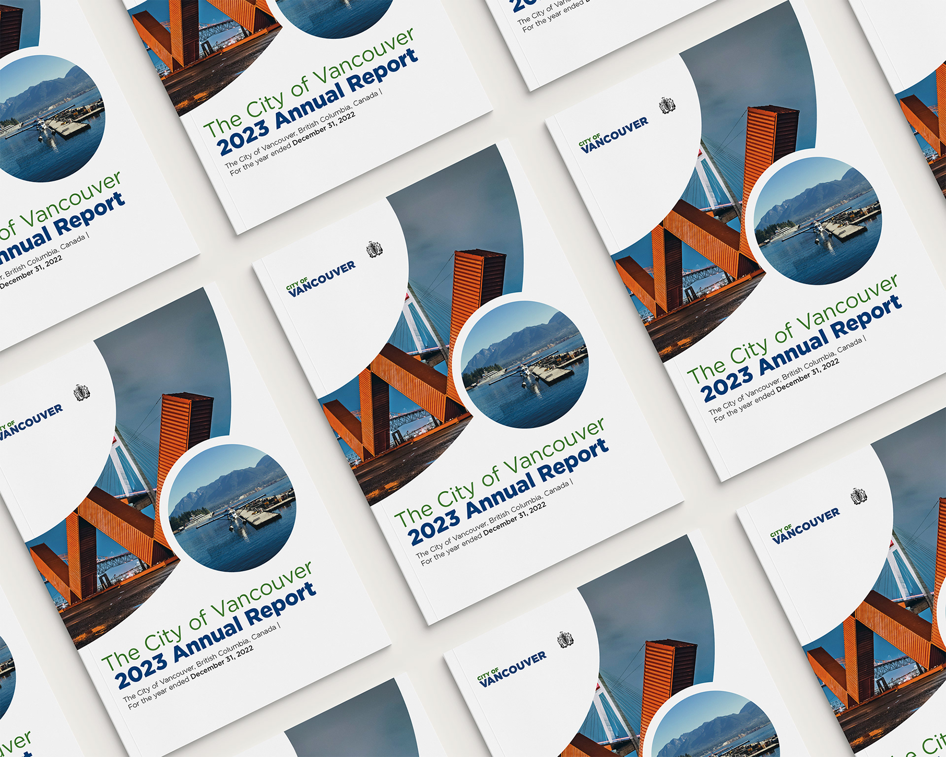
Annual Report - Front Cover
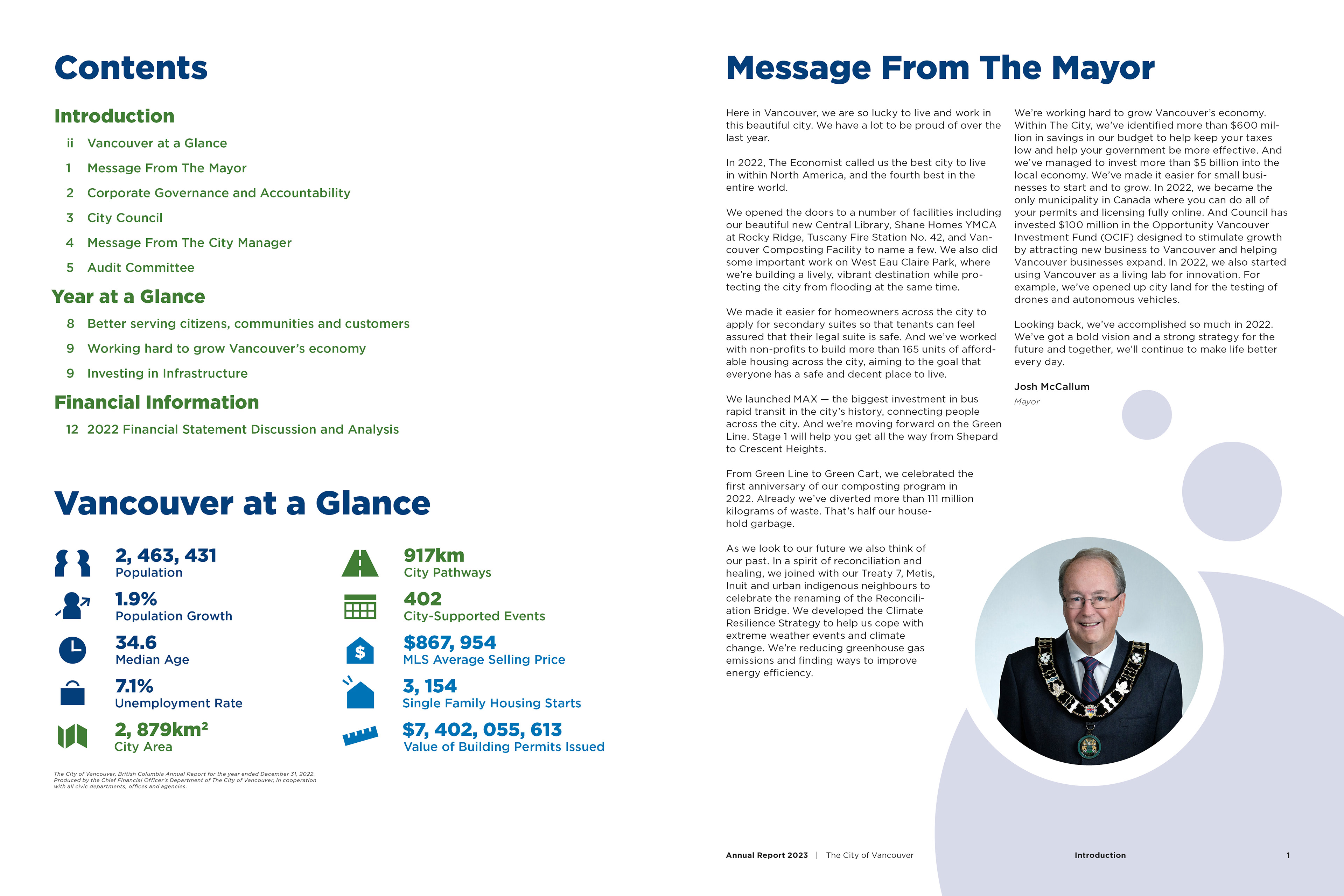
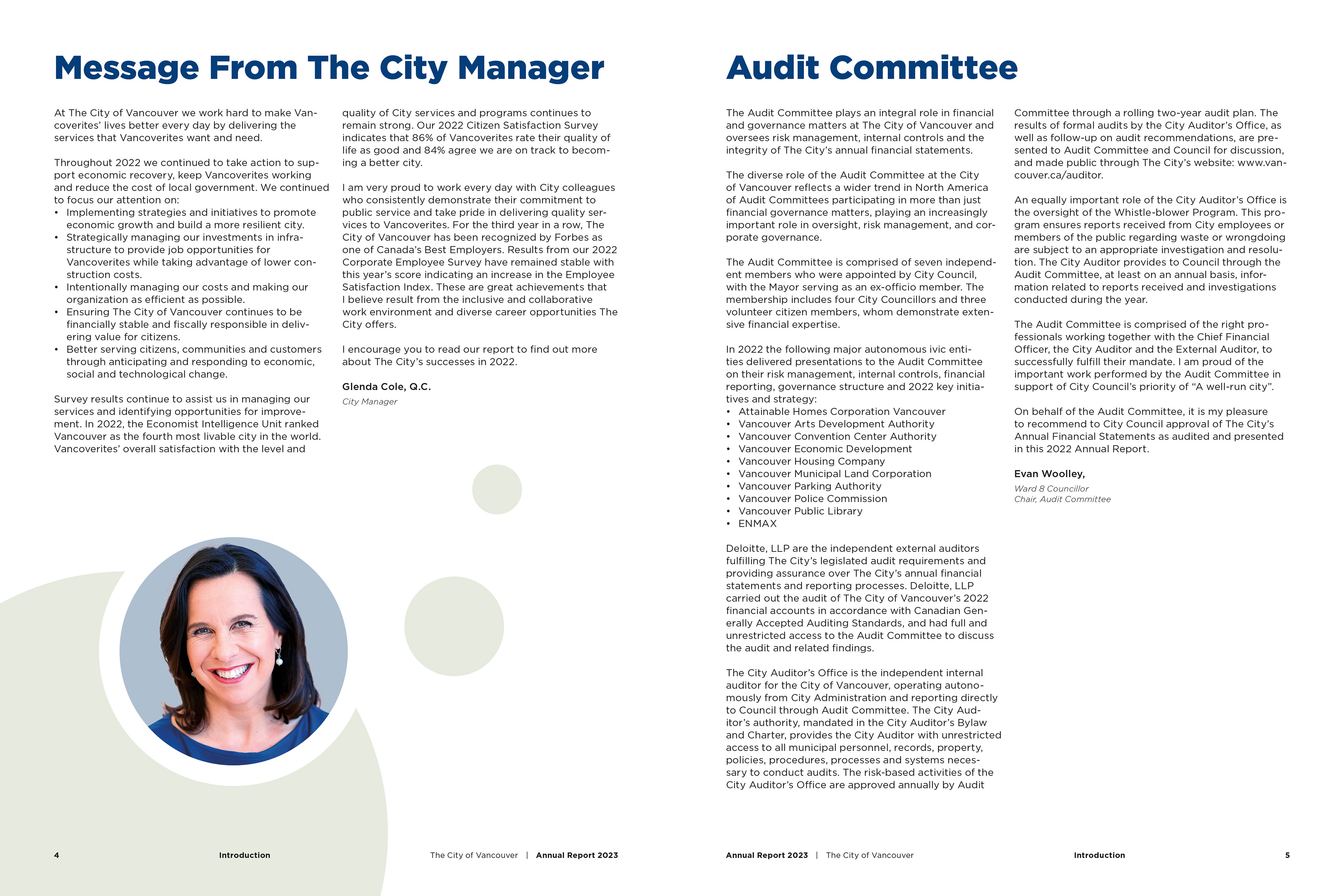
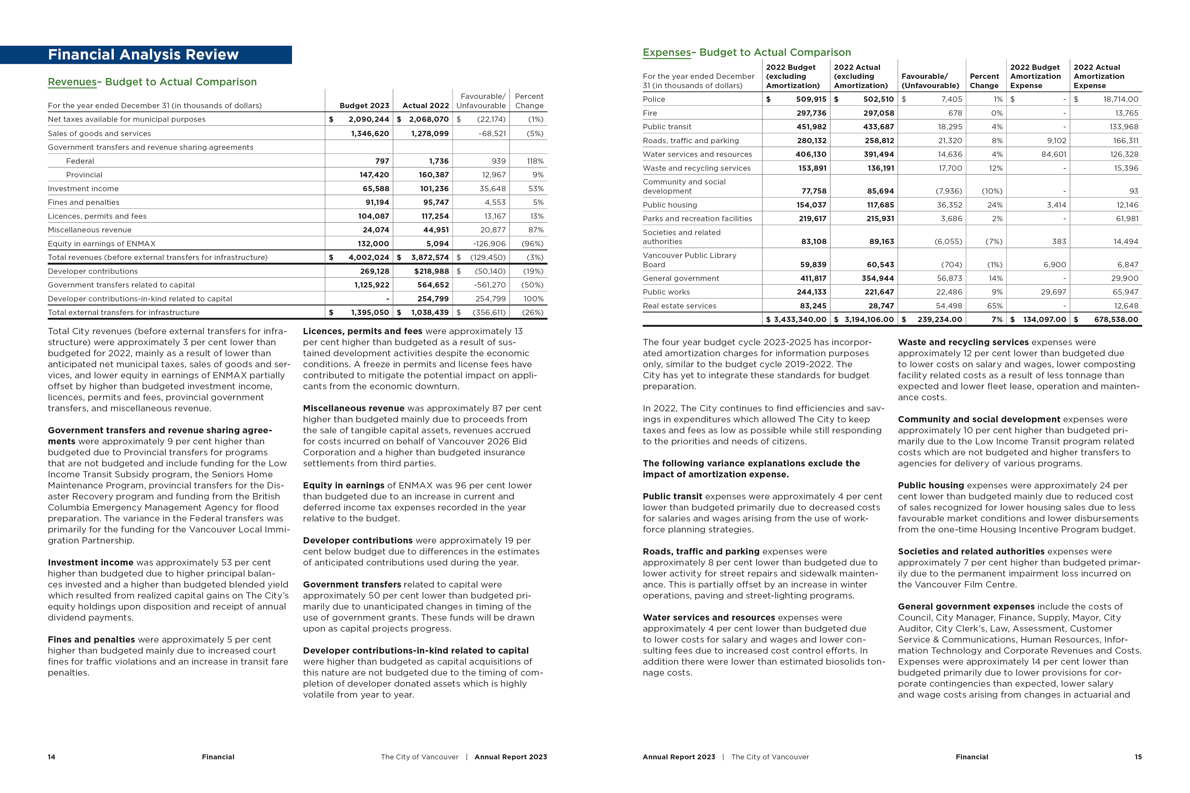
Annual Report - Spread 1
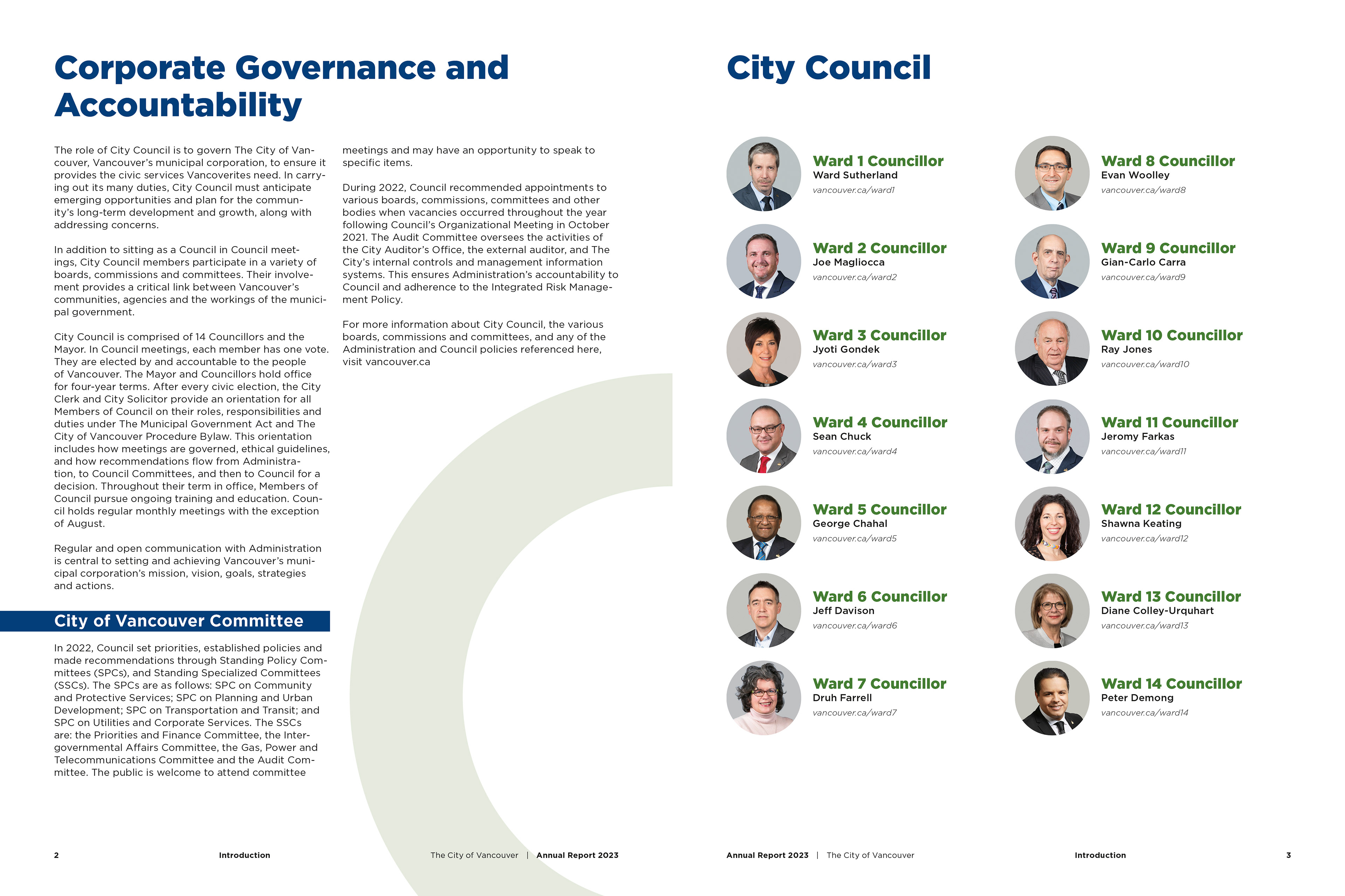
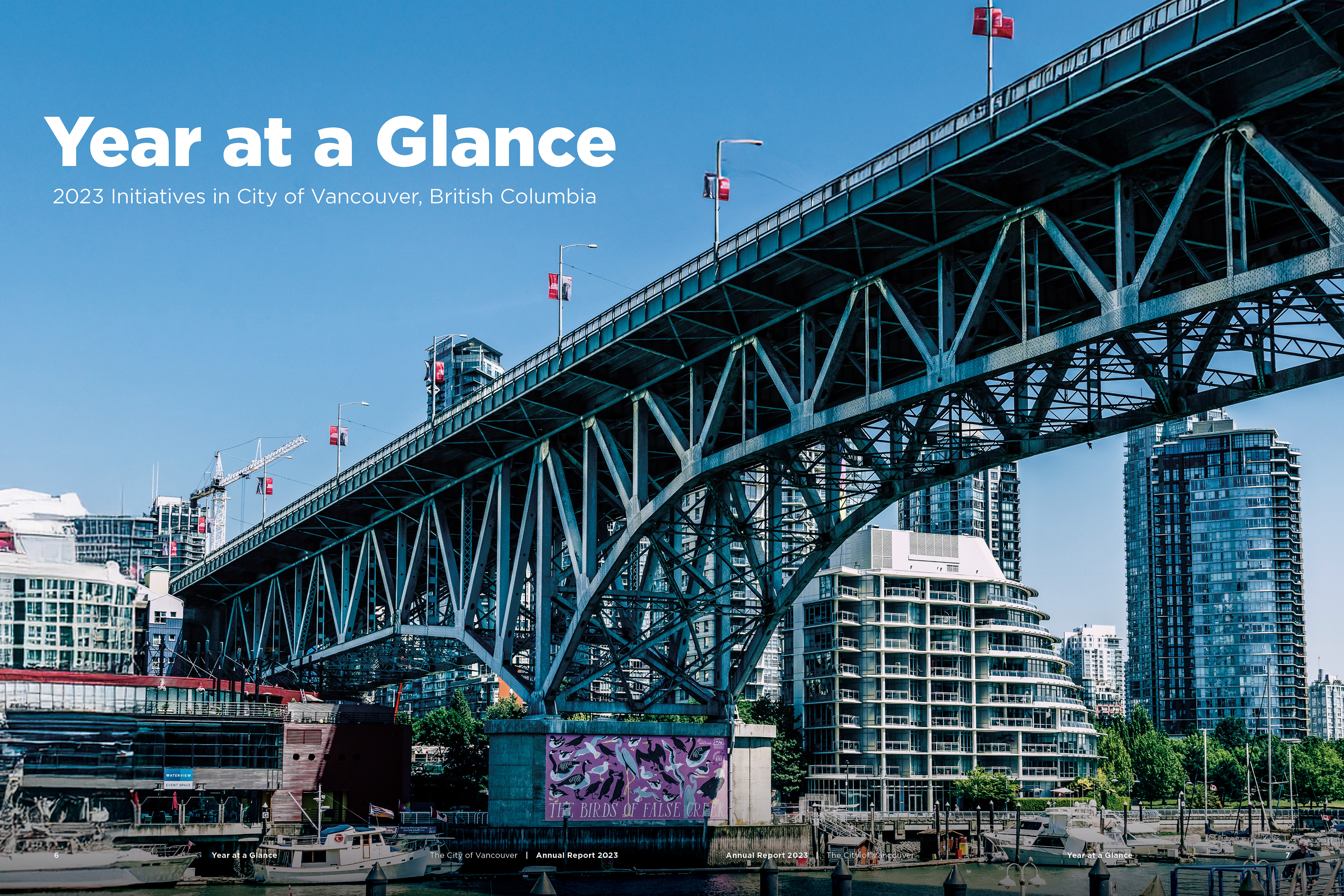
Annual Report - Spread 2
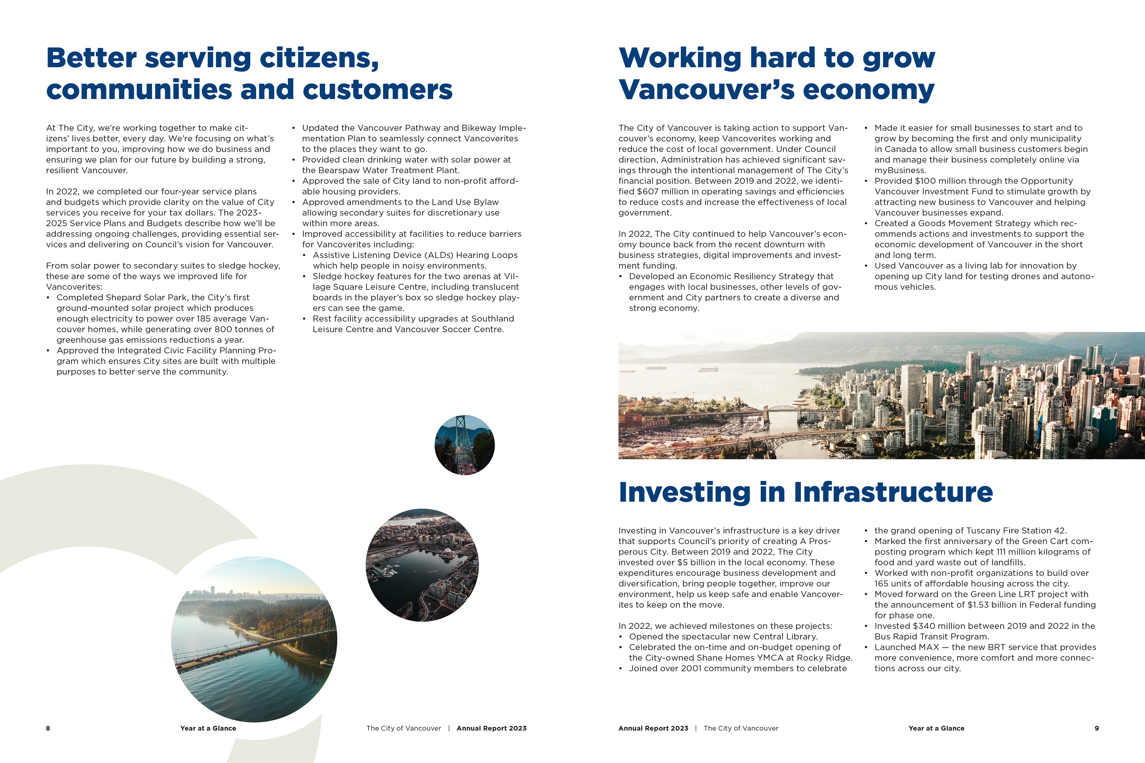
Annual Report - Spread 3
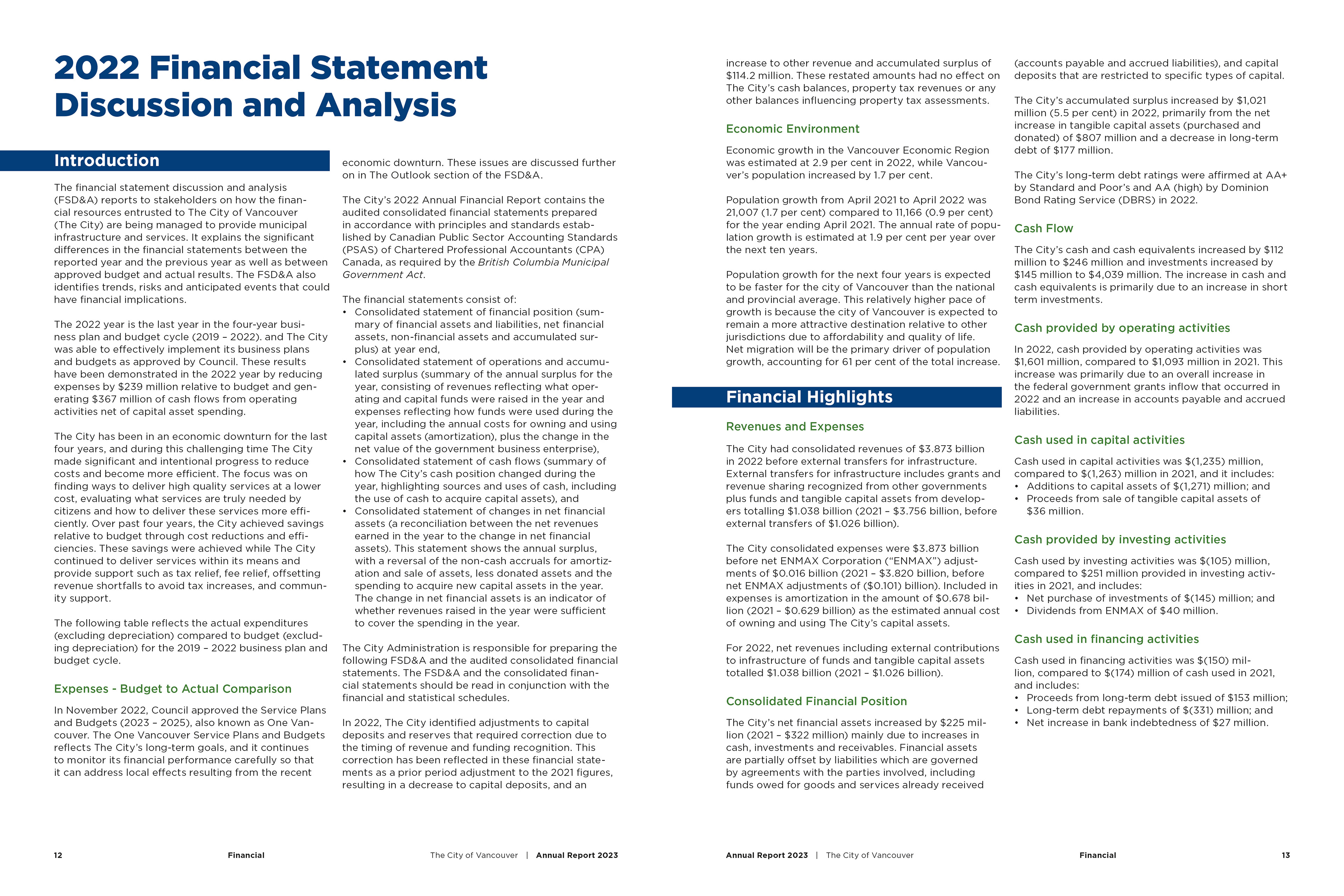
Annual Report - Spread 4
Annual Report - Spread 5

Annual Report - Spread 6
Annual Report - Spread 7
Annual Report - Spread 8
Annual Report - Spread 9
Annual Report - Spread 10
Annual Report - Spread 11
Annual Report - Spread 12

Annual Report - Spread 13
Annual Report - Back Cover
Summary
This project taught me how to find creative opportunities inside a highly structured brief. It pushed me to think critically about pacing, tone, and consistency. Through small but thoughtful design choices, I was able to bring in a sense of voice while still meeting every requirement. It reinforced that even in strict projects, design can still feel intentional and human.